Dollar Lash Club Ltd.

https://www.onedollarlashclub.com
Since September 2020, I’ve had the opportunity to work full-time in-house and remotely as a Jr. Designer and Content Creator at Dollar Lash Club Ltd. During my time here, the e-commerce company has focused on re-branding their product line, traditional and digital marketing strategies to elevate their Shopify web-store and content creation for their social media channels. With a small-business mindset, the company targets LA influencers and experienced make-up artists to novice lash enthusiasts and creatives alike, located in the US and Canada. As they work with affiliates, aka their “Tribe of Unicorns,” the brand gains autonomous promotion in exchange for product endorsement and other opportunities on their creative platform.
On top of my every day tasks, I creatively implemented my own concepts and strategies towards campaigns and other creative projects. These larger projects include packaging design, printed marketing inserts, campaign creative management, photographing and rendering images and publishing written content.
The Rebrand.
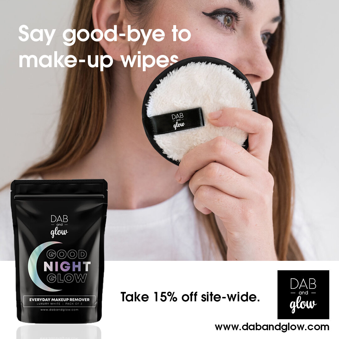
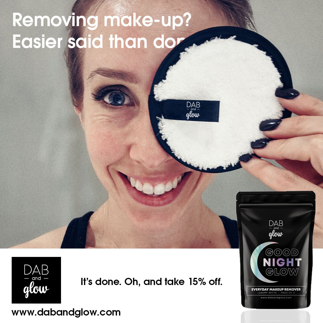
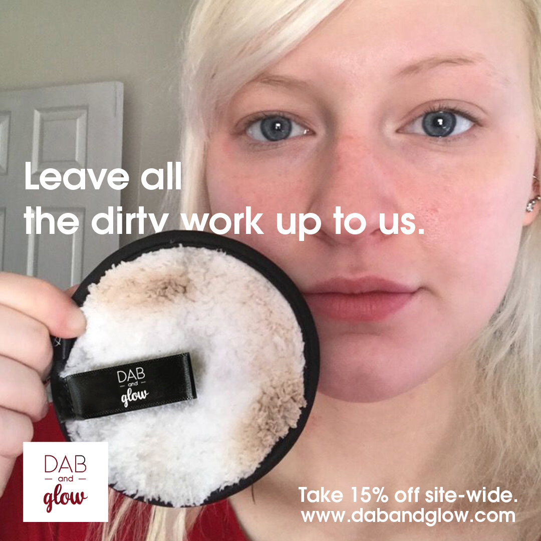
I was delighted to have entered the company at a time when they were transitioning their brand identity. I witnessed hands on how the switch- over went from their website, to their packaging, to how this created an overall fresh presence and that was communicated affectively with their audience. Working on projects that involved creating assets for their new identity and seeing them implemented towards their growth was extremely gratifying. Below are some examples of content created during the rebrand (including Adverts for its sister brand Dab & Glow), as well as Dollar Lash Club’s visual brand standards that I complied to when taking on each project.

Old Logo

Updated Logo

Logo Lockups Against White

Logo Lockups Against Navy

Colour Palette

Type Family
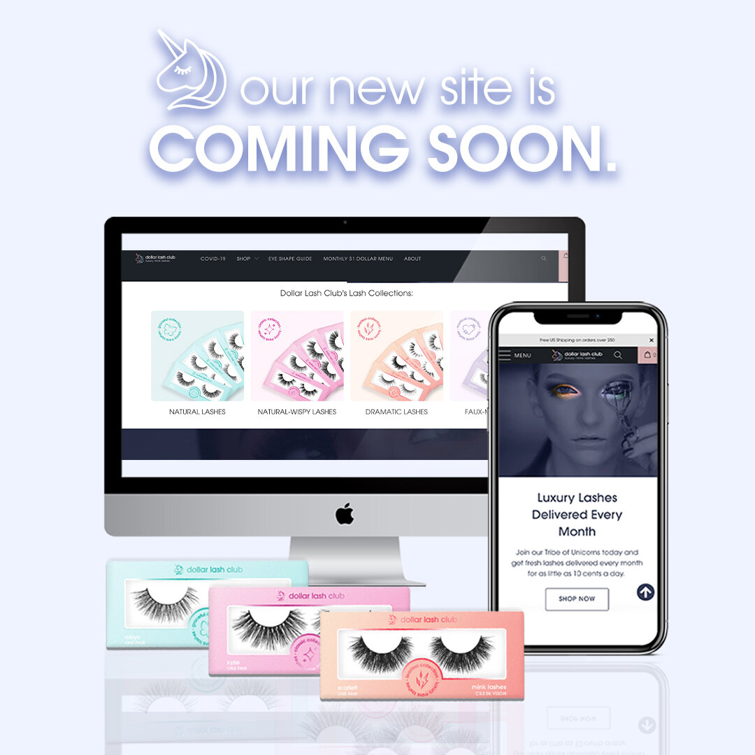
Old Website Design

New Website Design

Iconography.
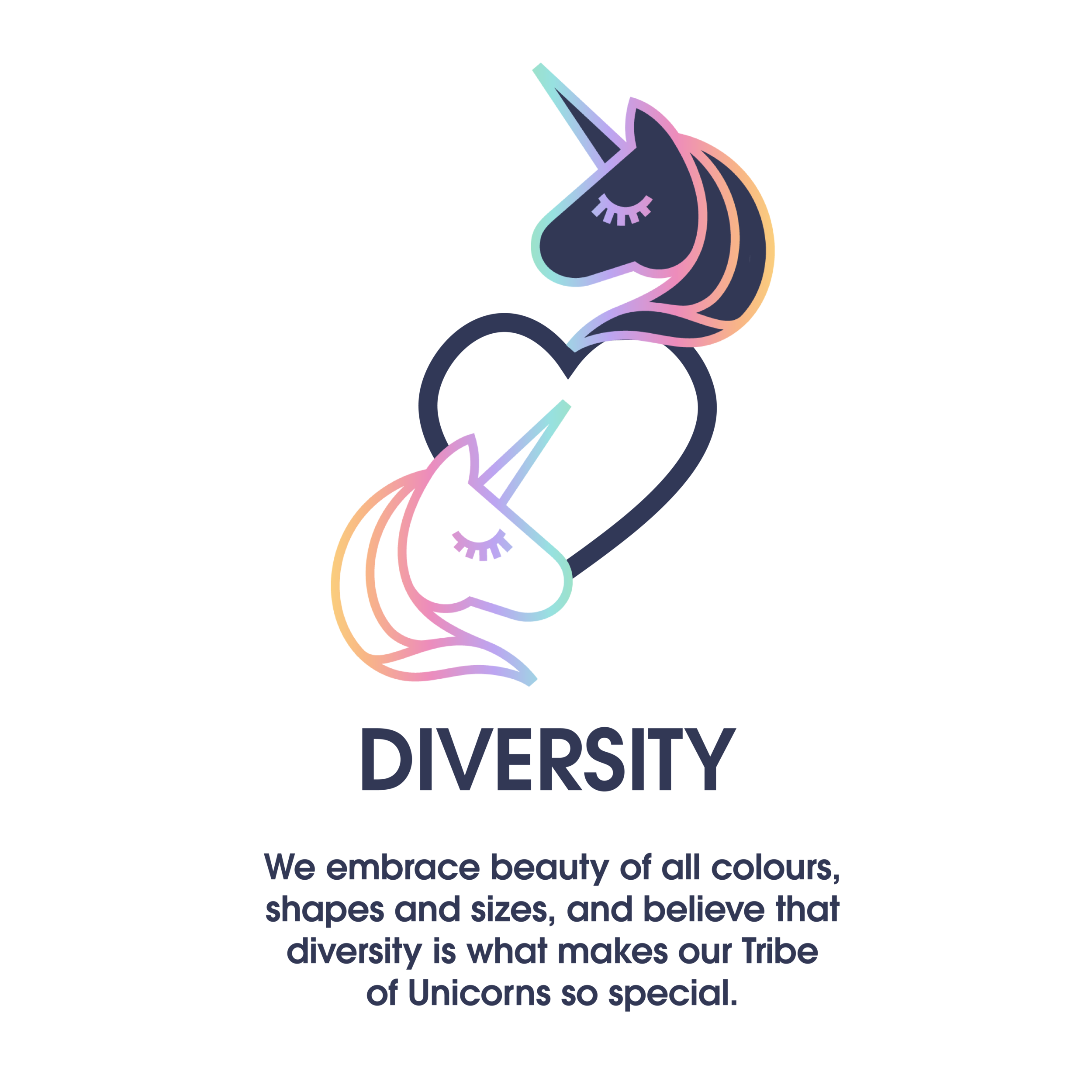
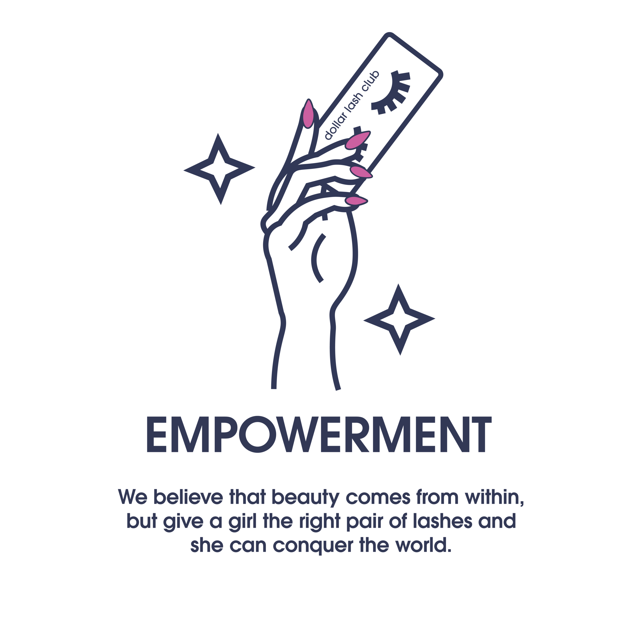
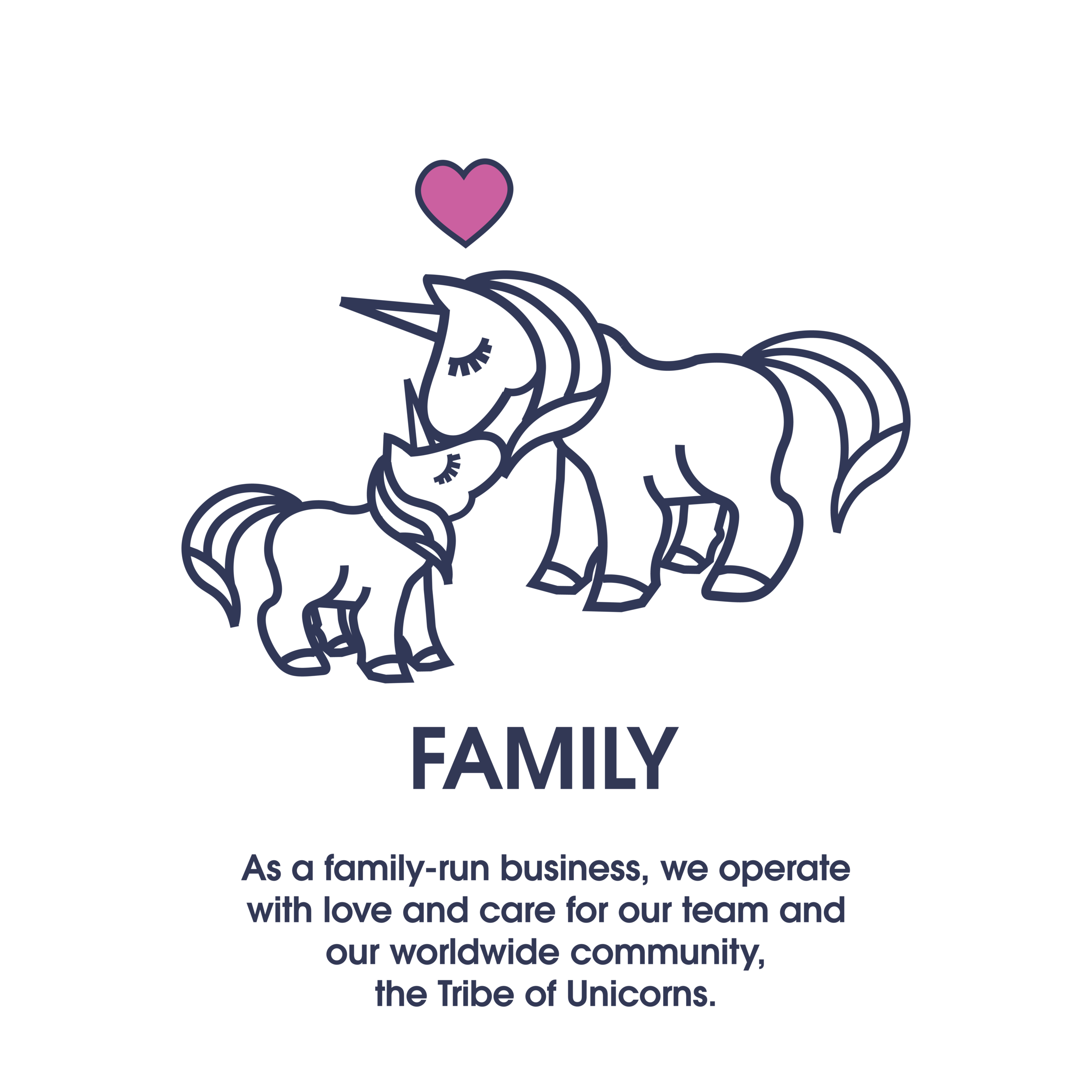
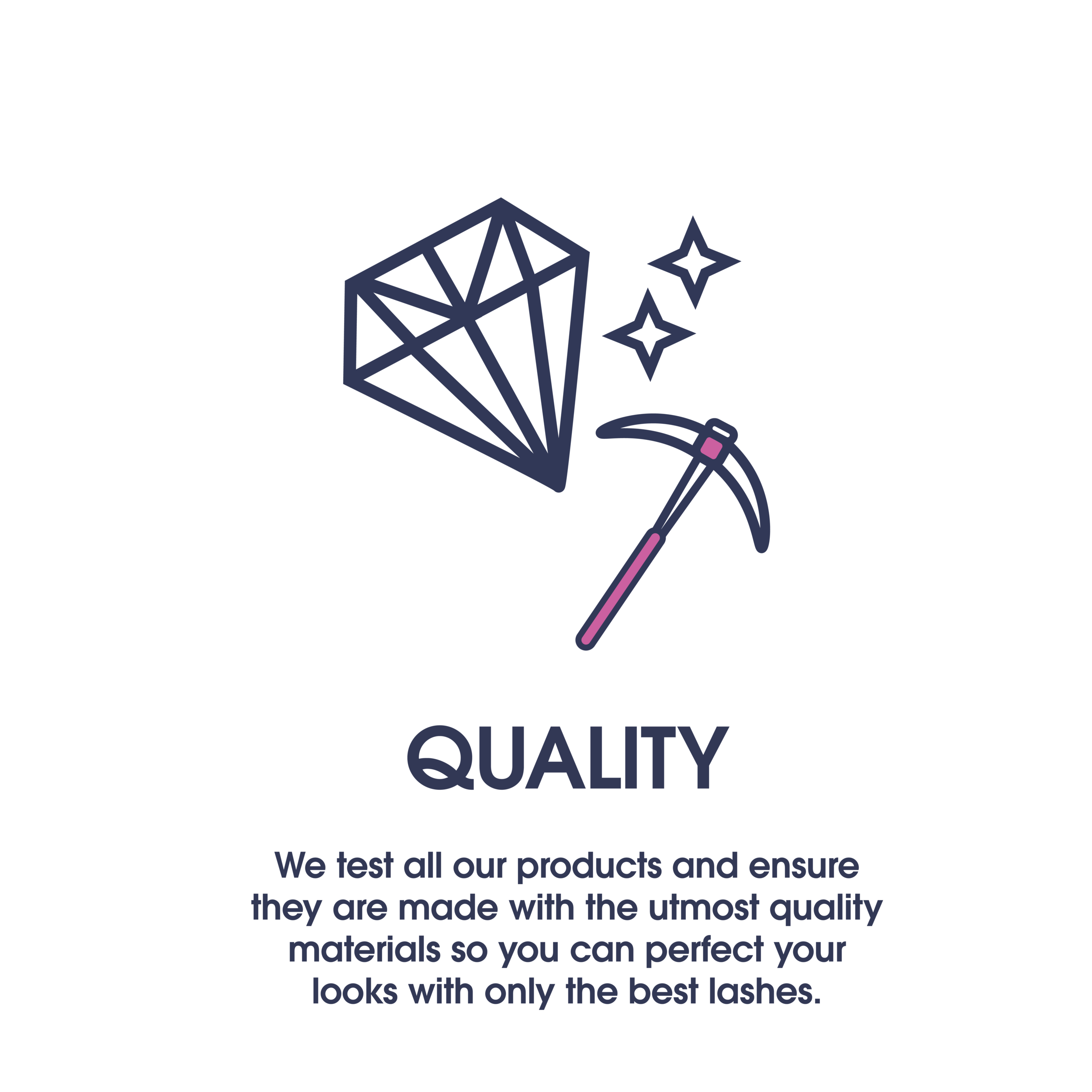
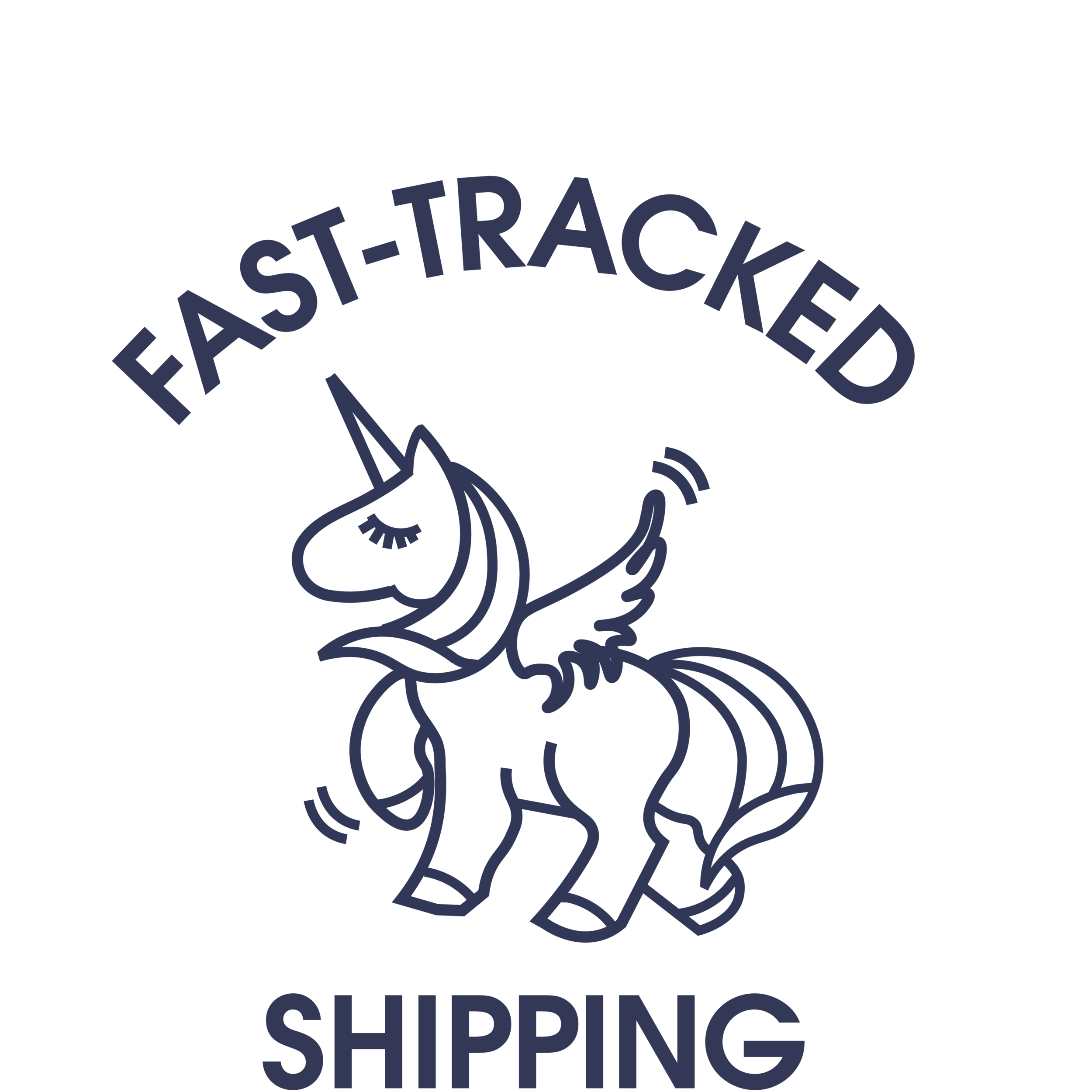
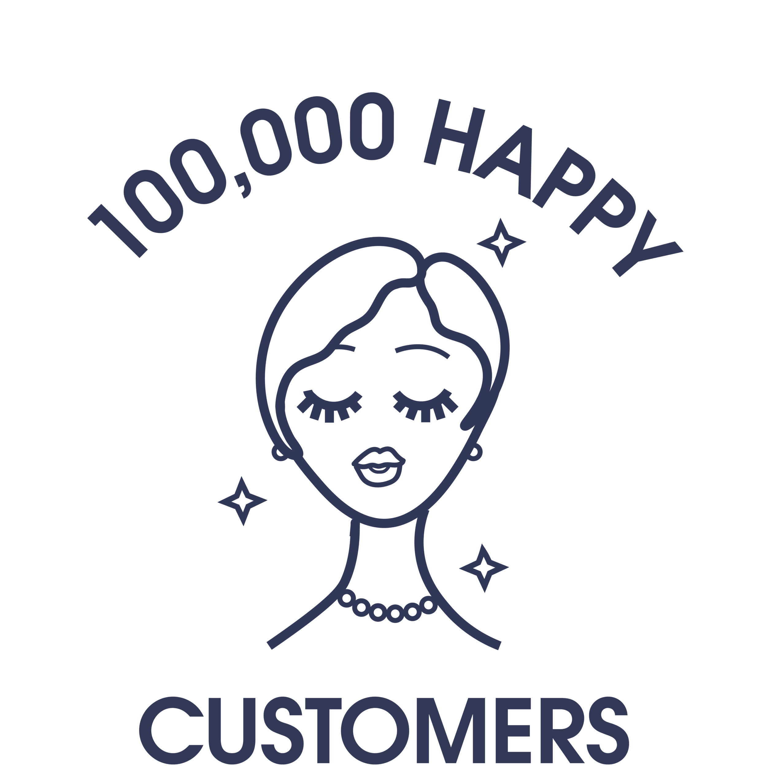
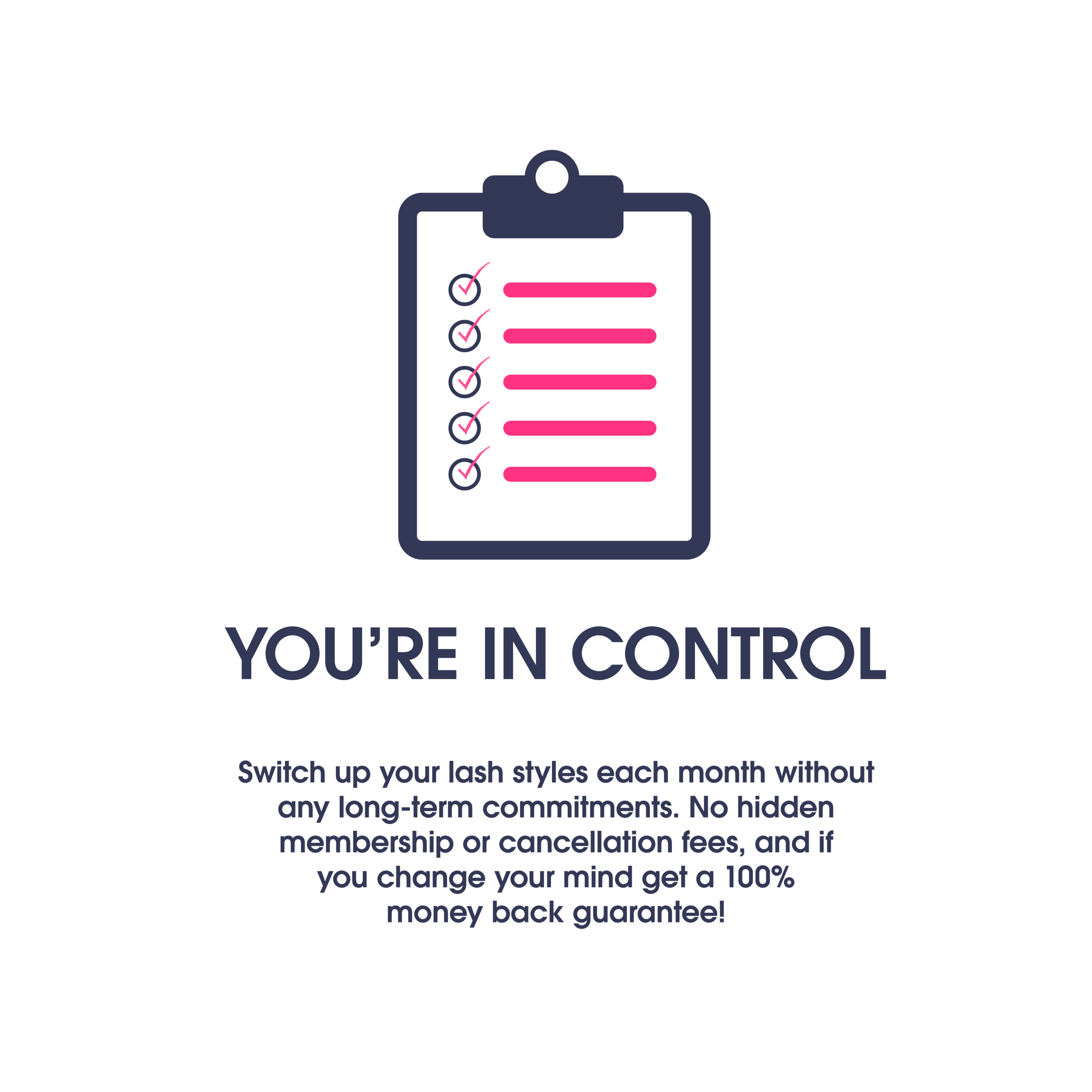
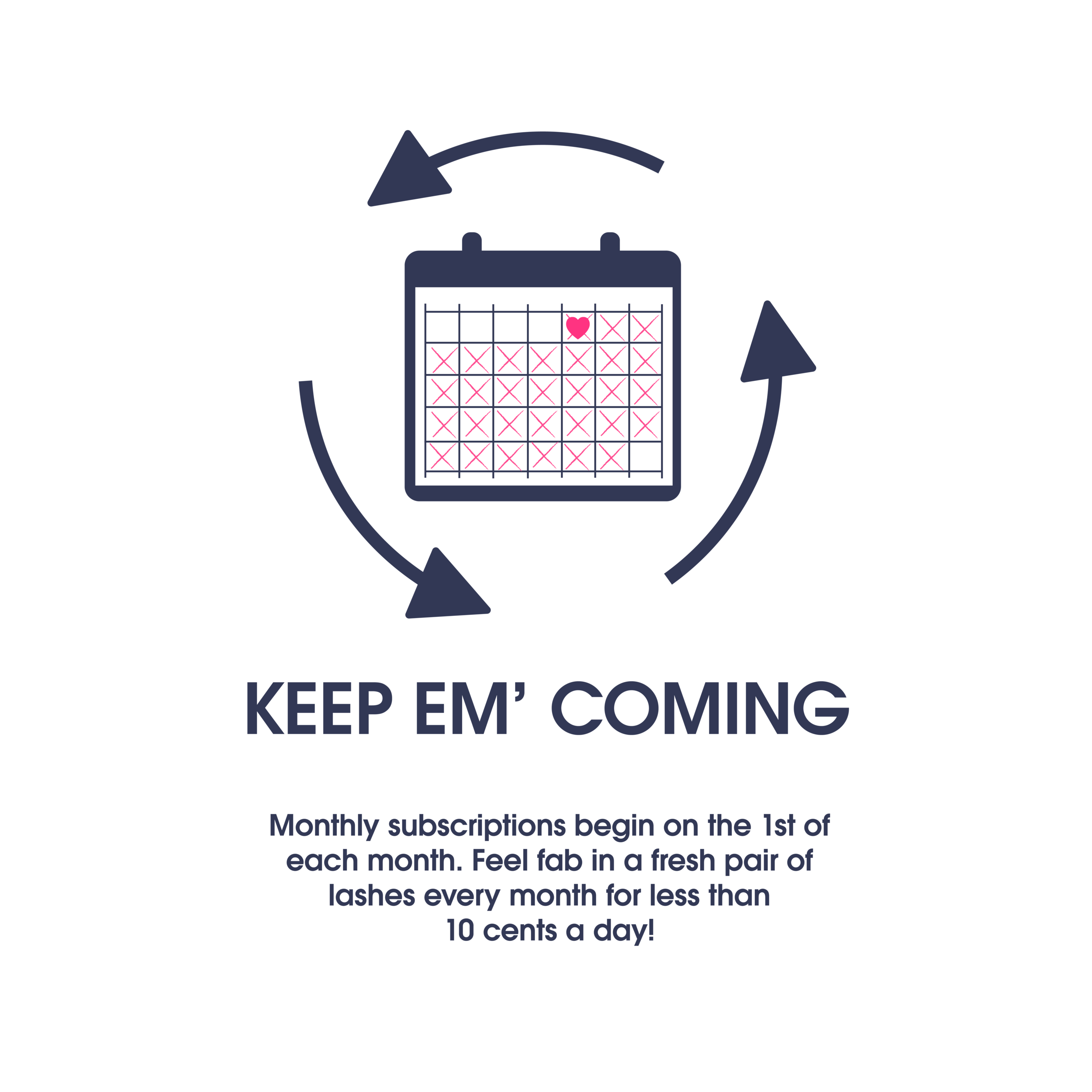
On top of the rebrand, a significant component to the new visual aesthetic was to create a visual language that helped customers easily identify and understand the brand’s ethos. Here I created different icons for DLC’s website that served as visual indicators to summarize their core values, offers and product details, their subscription service etc.


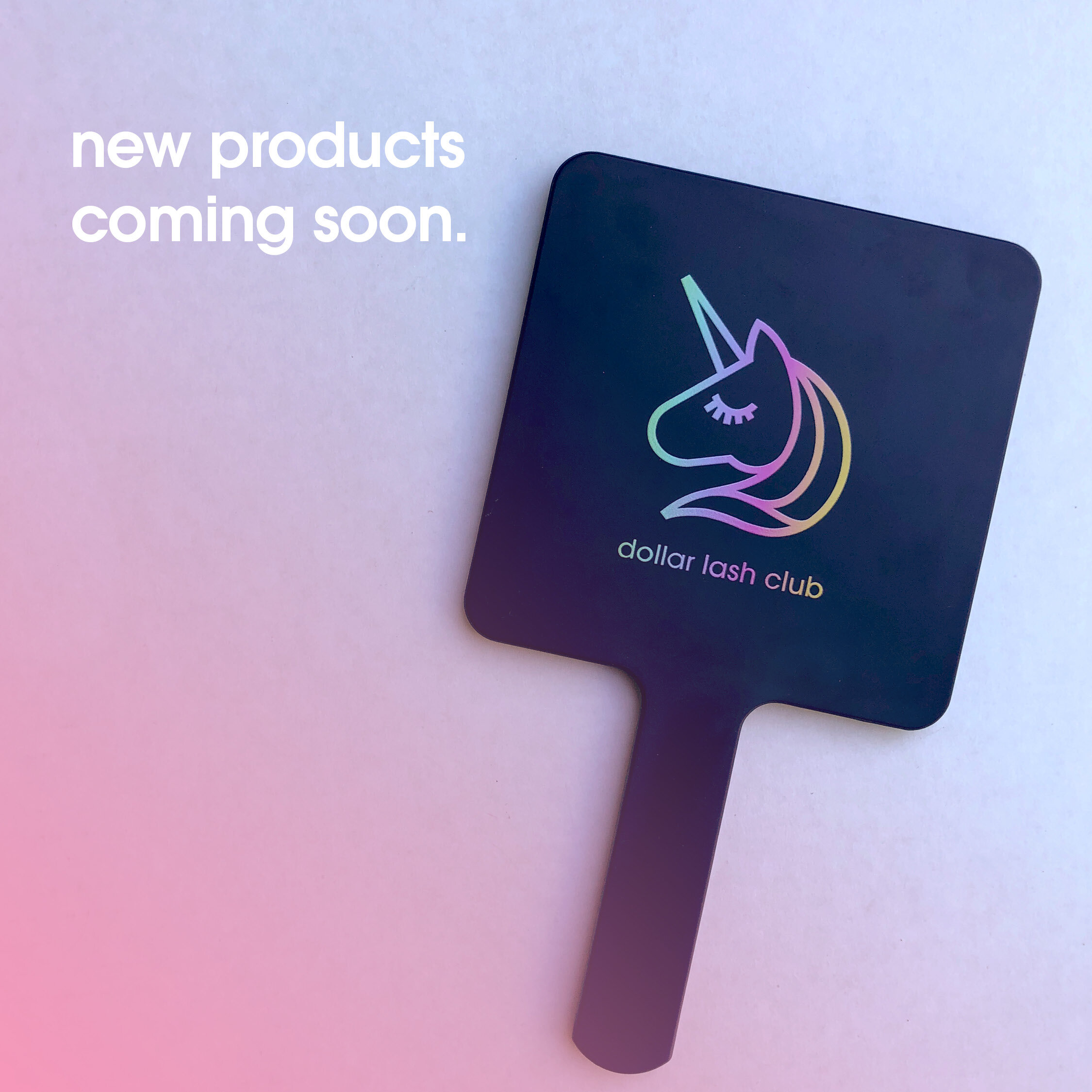
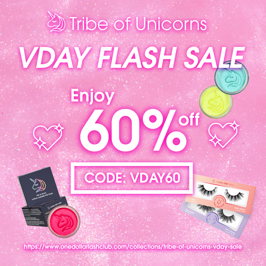
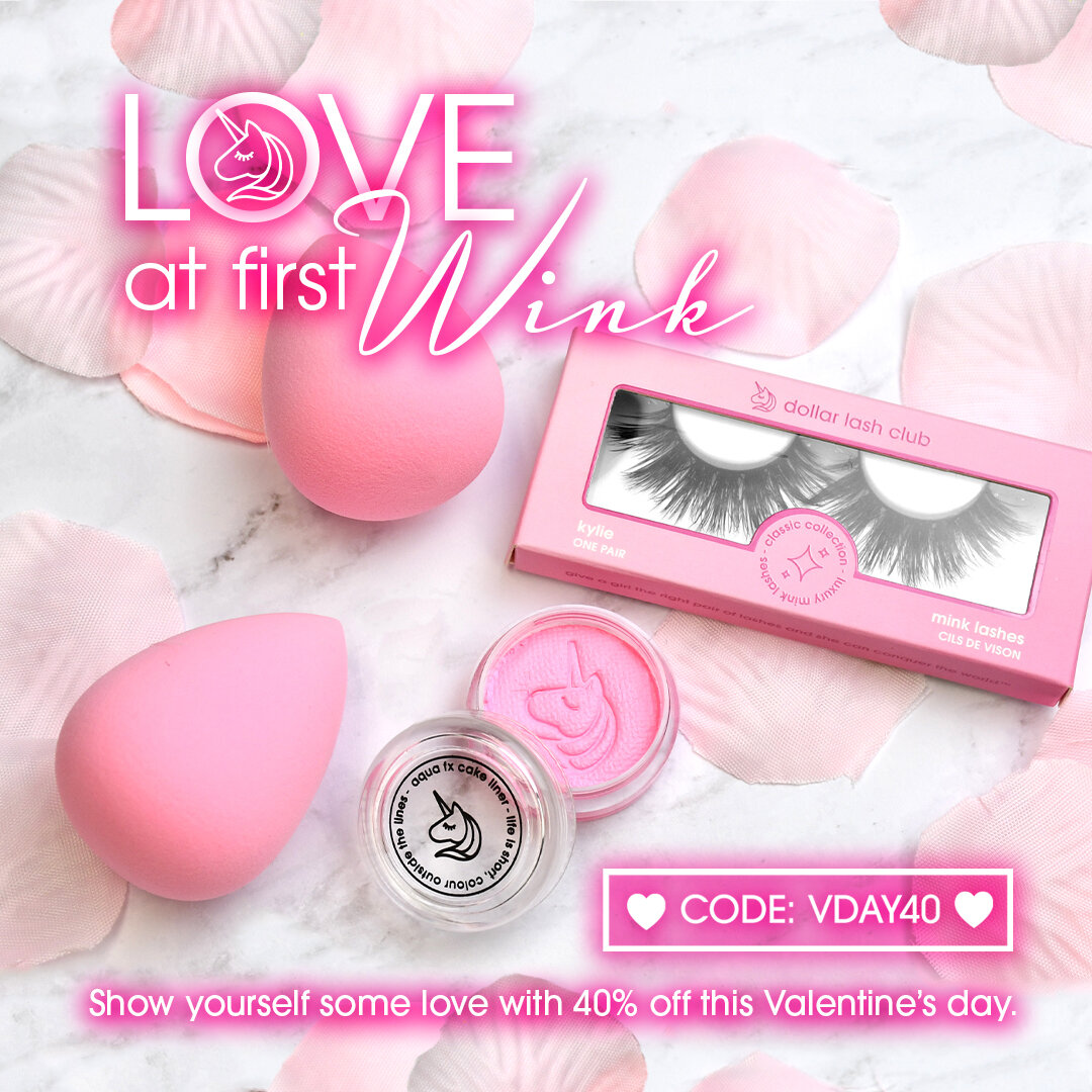
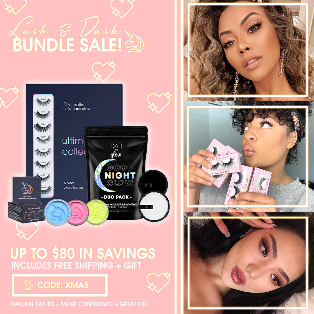
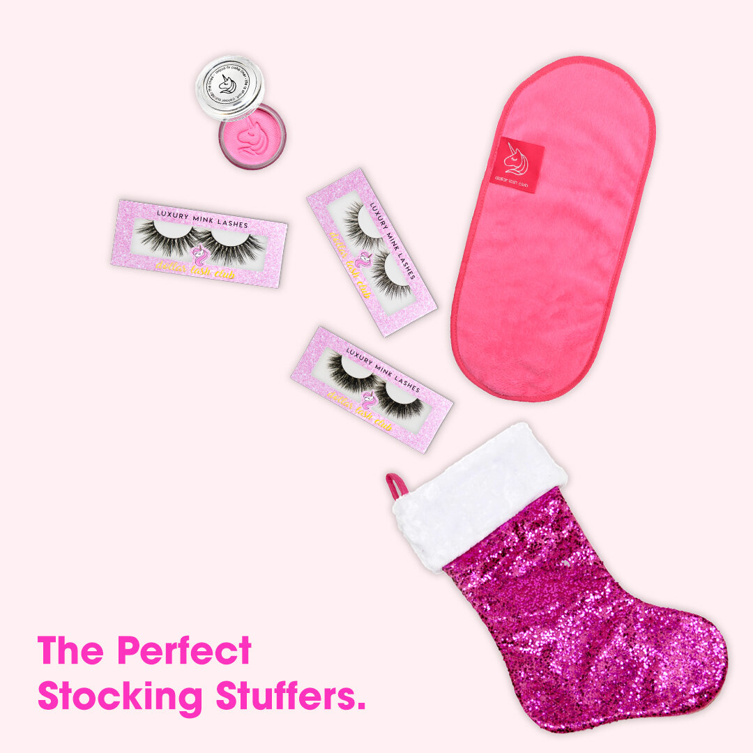
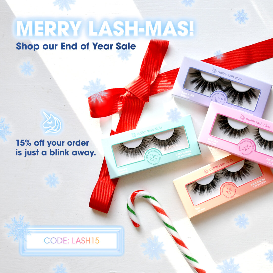
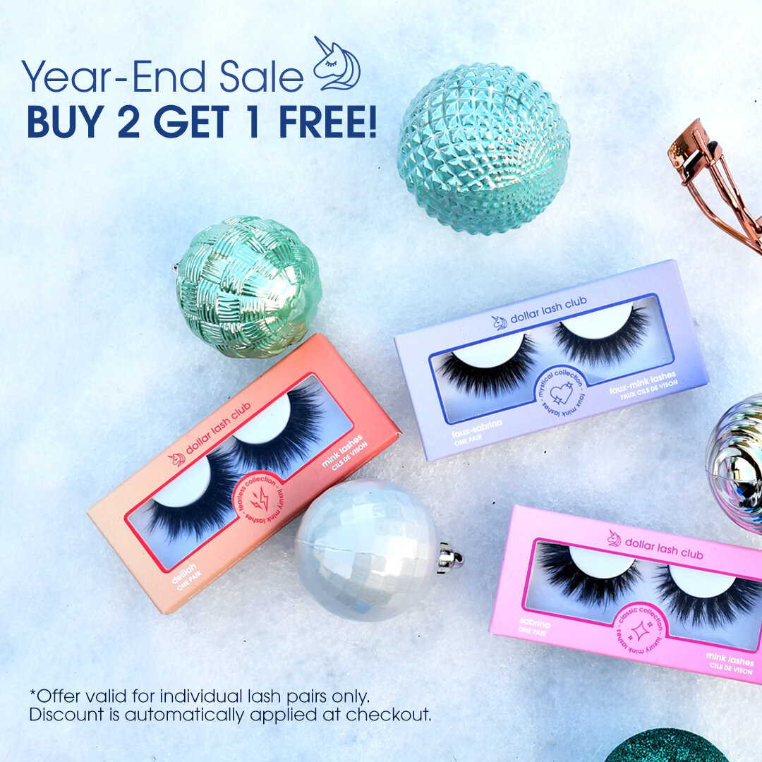
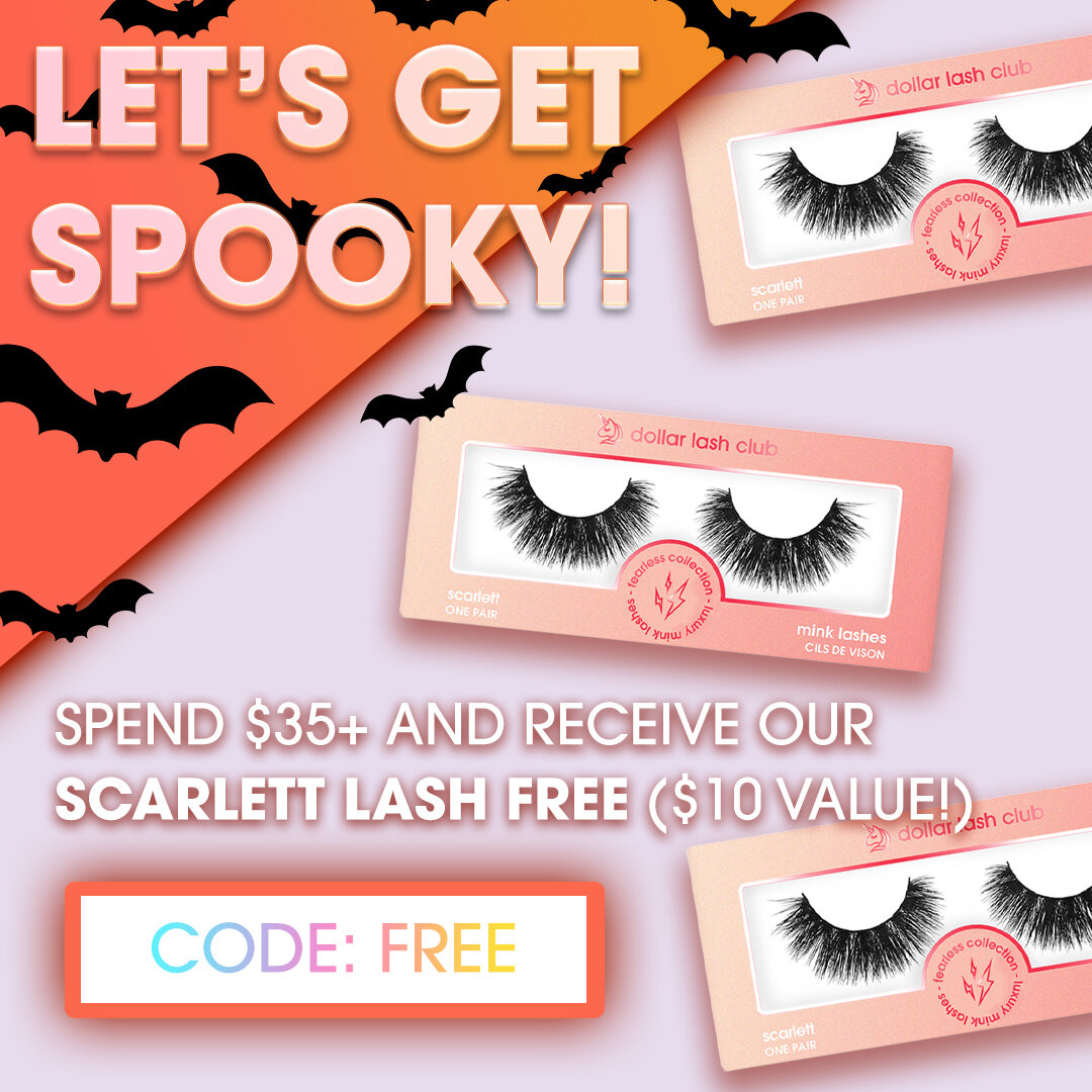
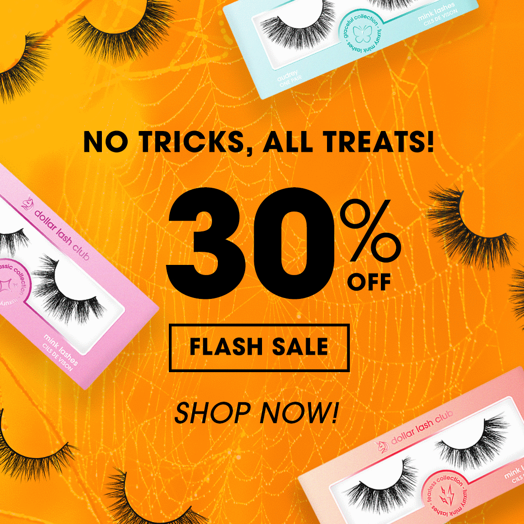
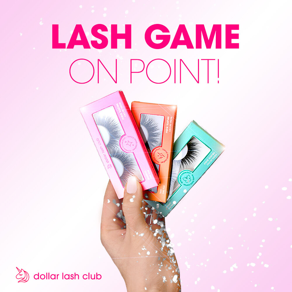
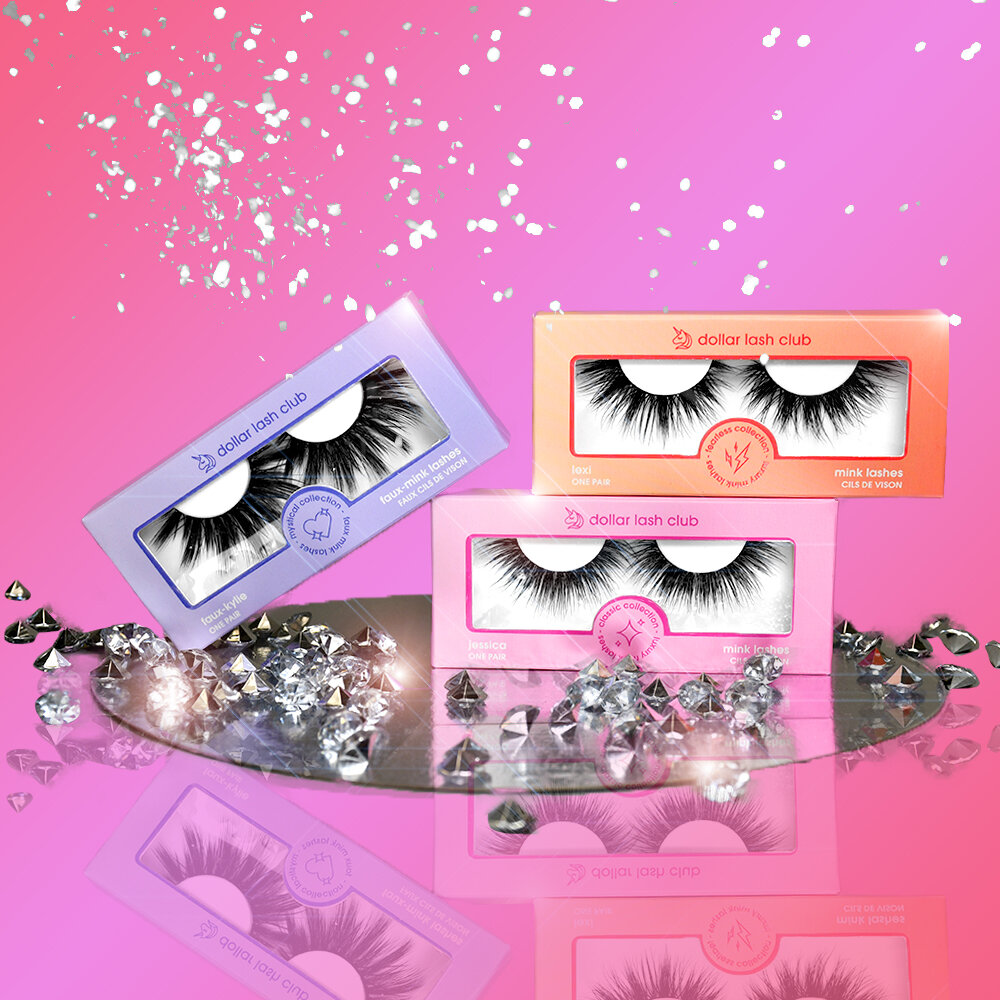
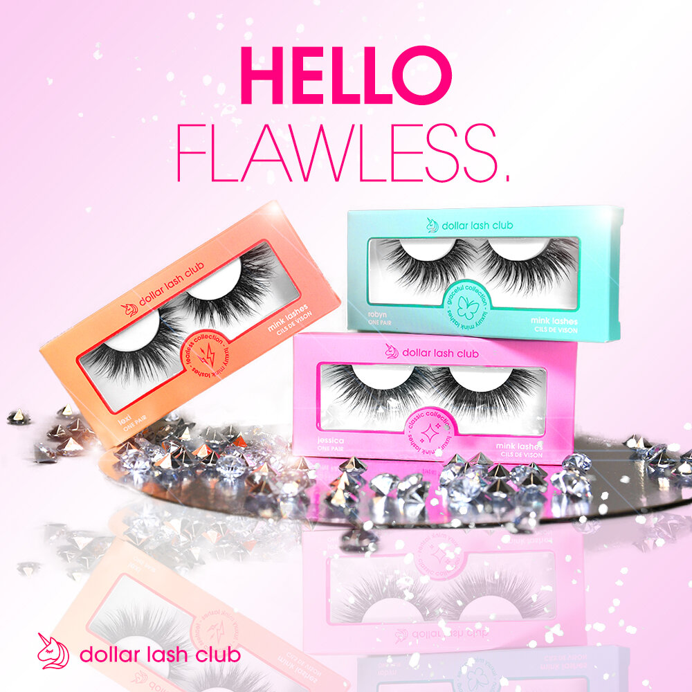
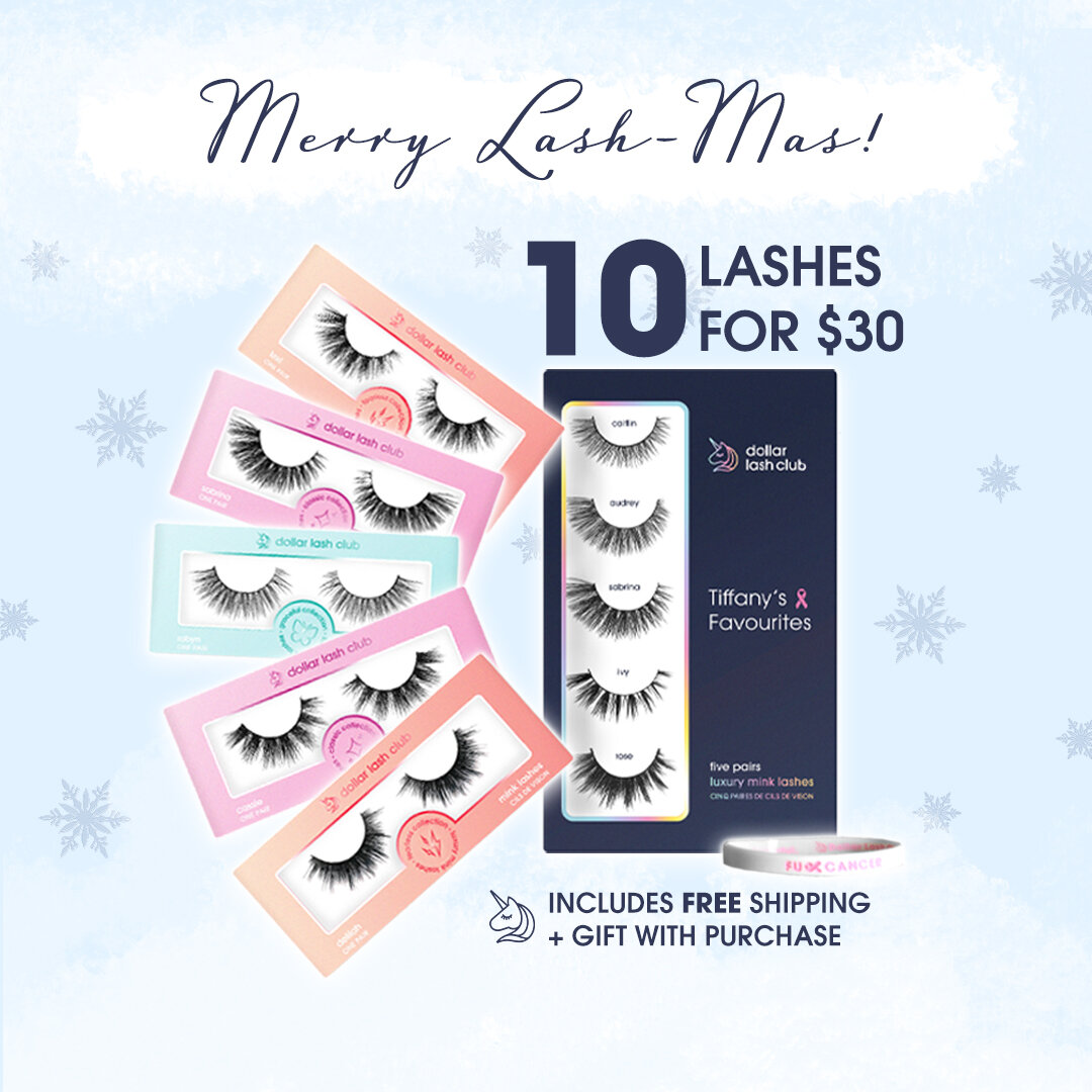
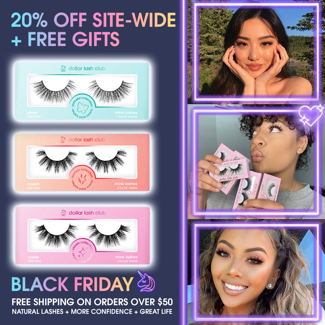
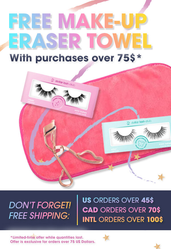
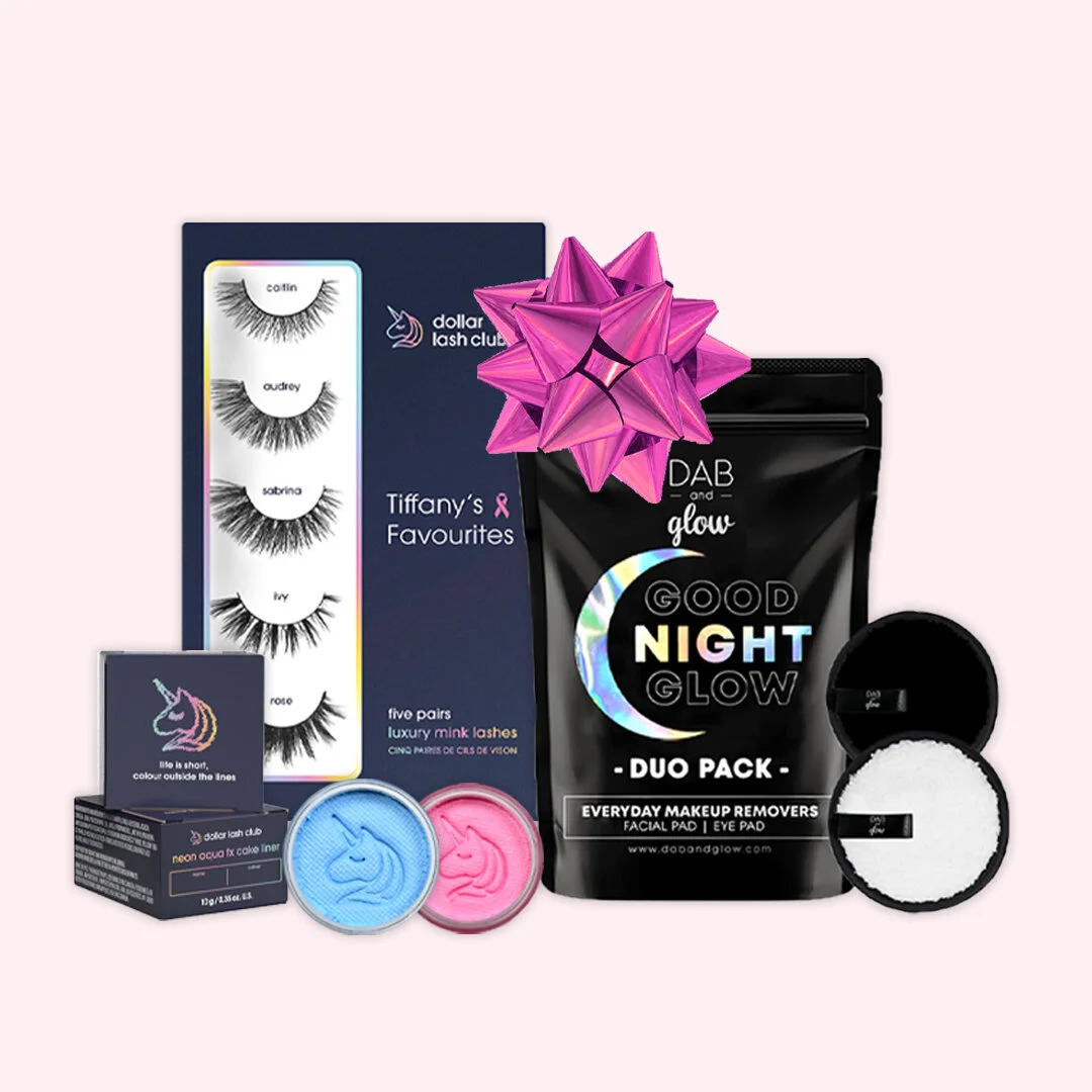
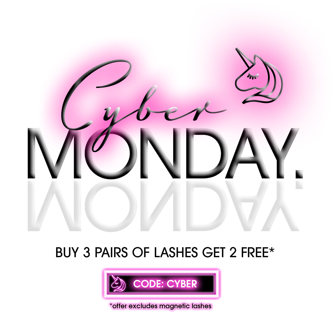
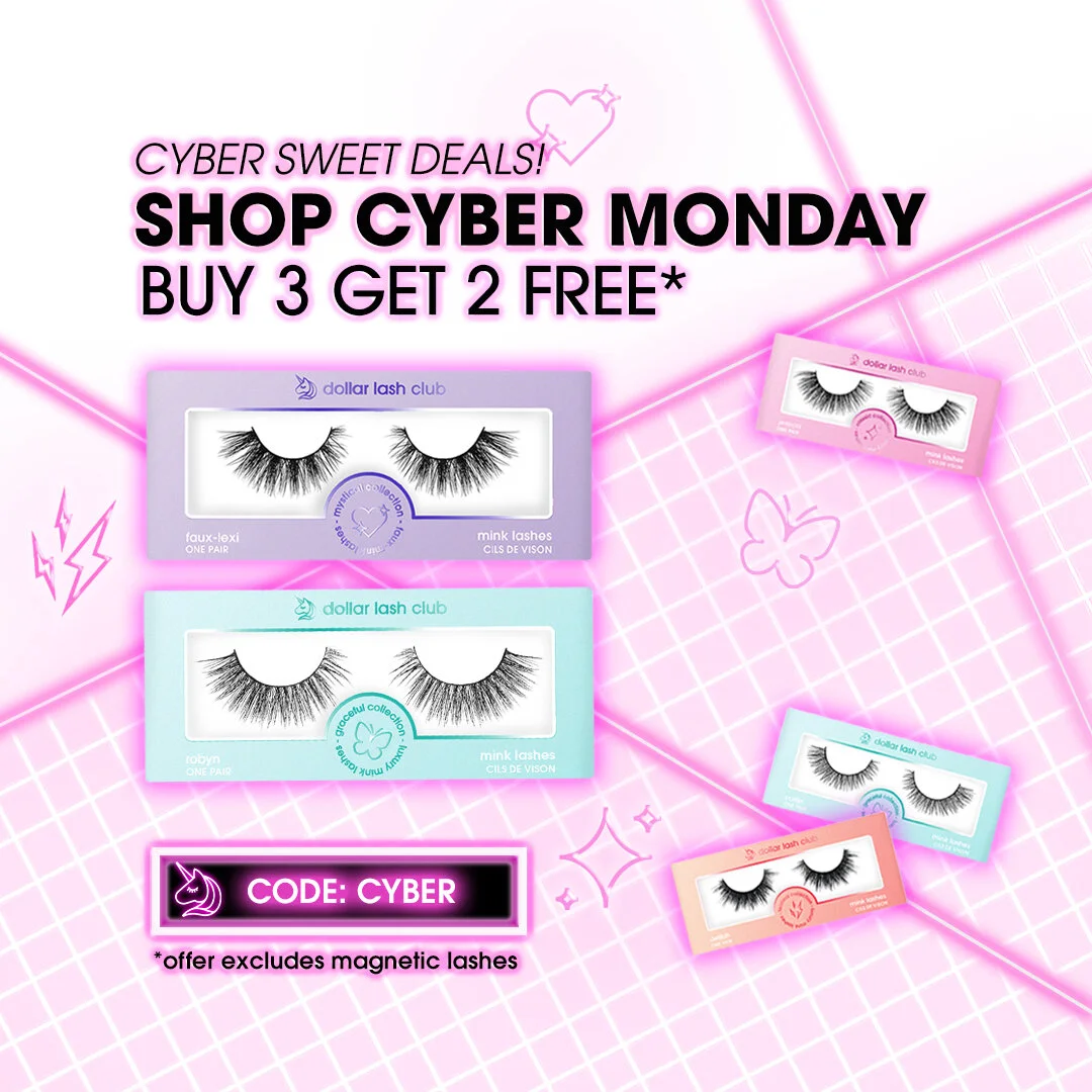
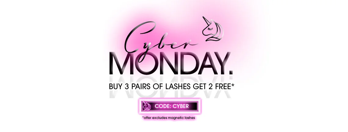
Graphic Adverts.
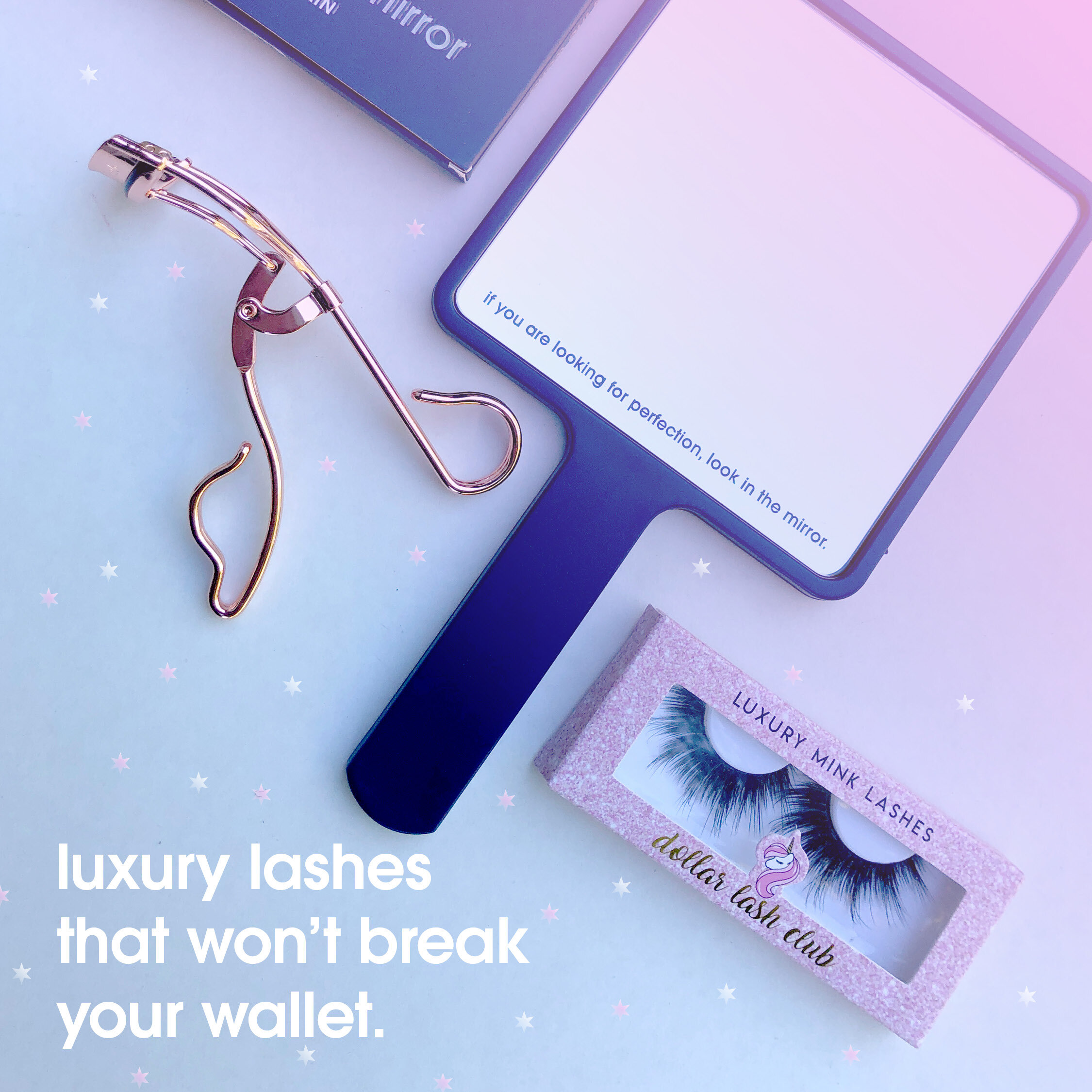
Complying with Dollar Lash Club’s brand integrity, I creatively executed from concept to finish social media adverts, newsletter/email assets, banner ads, campaign posts and other digital marketing content that was used on our different channels. I was fortunate enough to have creative freedom depending on the graphic’s intent, however I would mainly focus on utilizing the brand’s colour palette, type family, and complimentary typefaces or graphics.
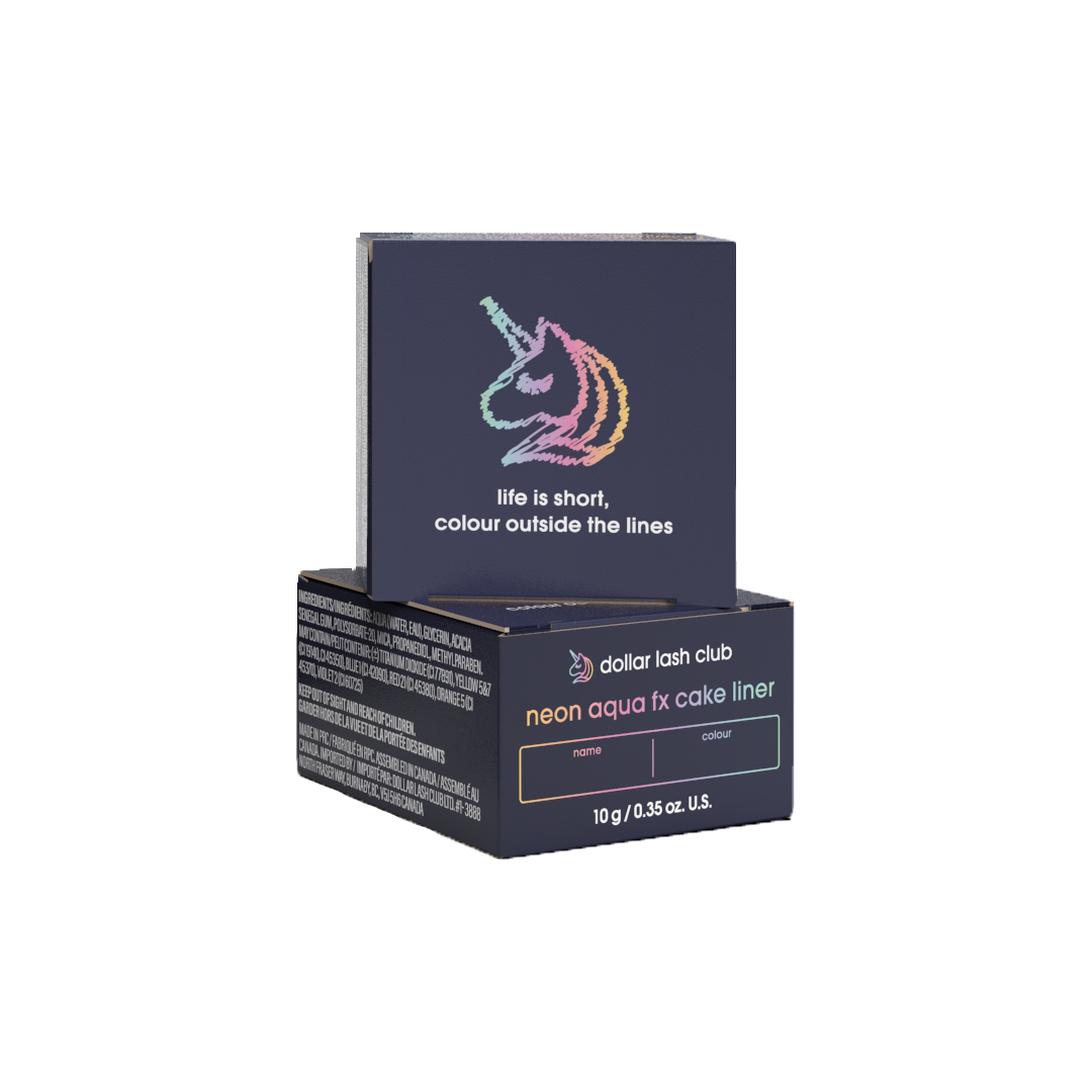
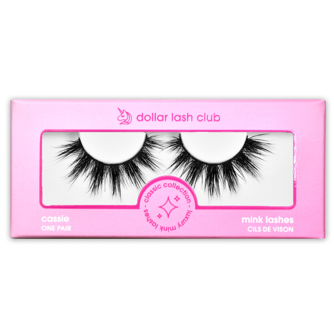
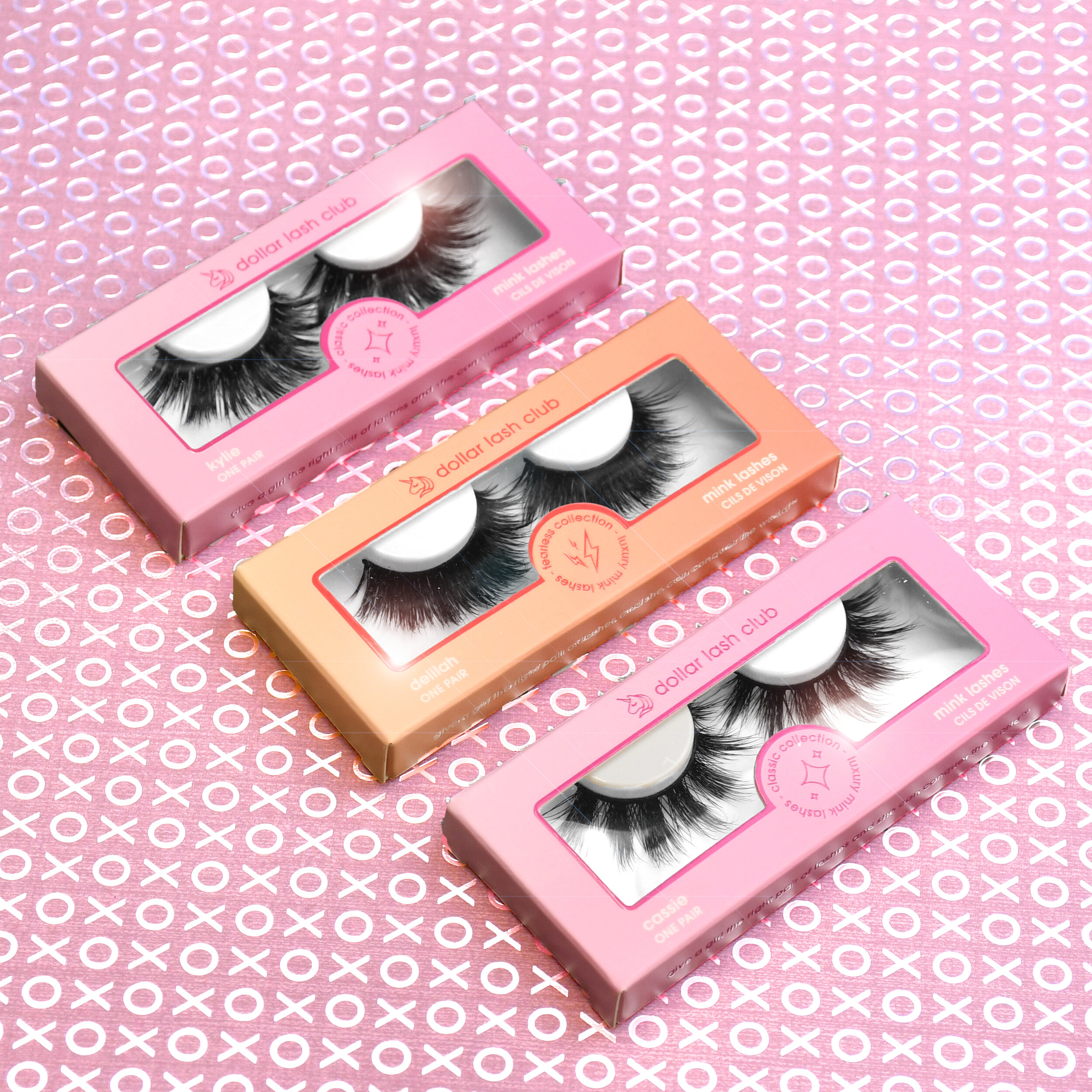
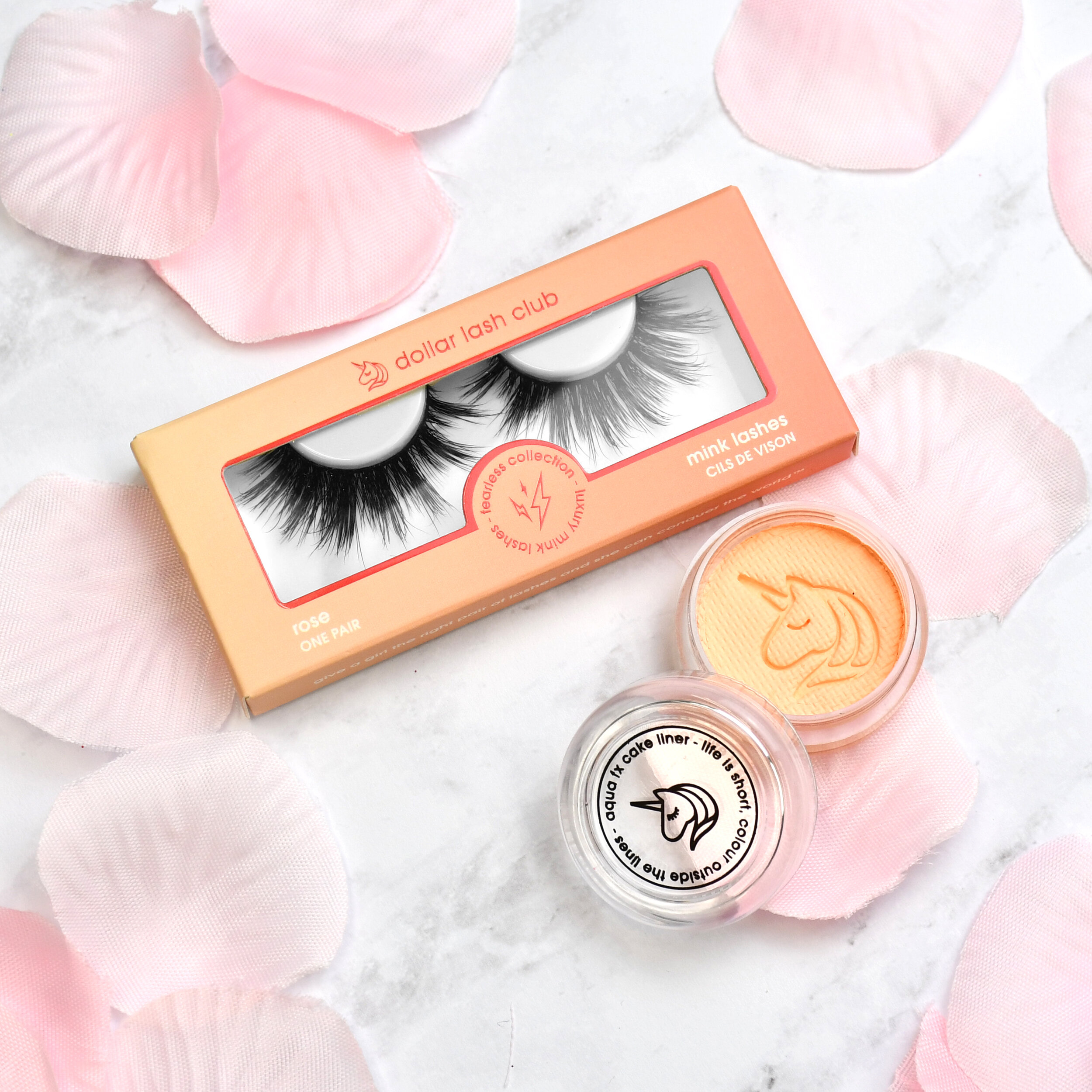
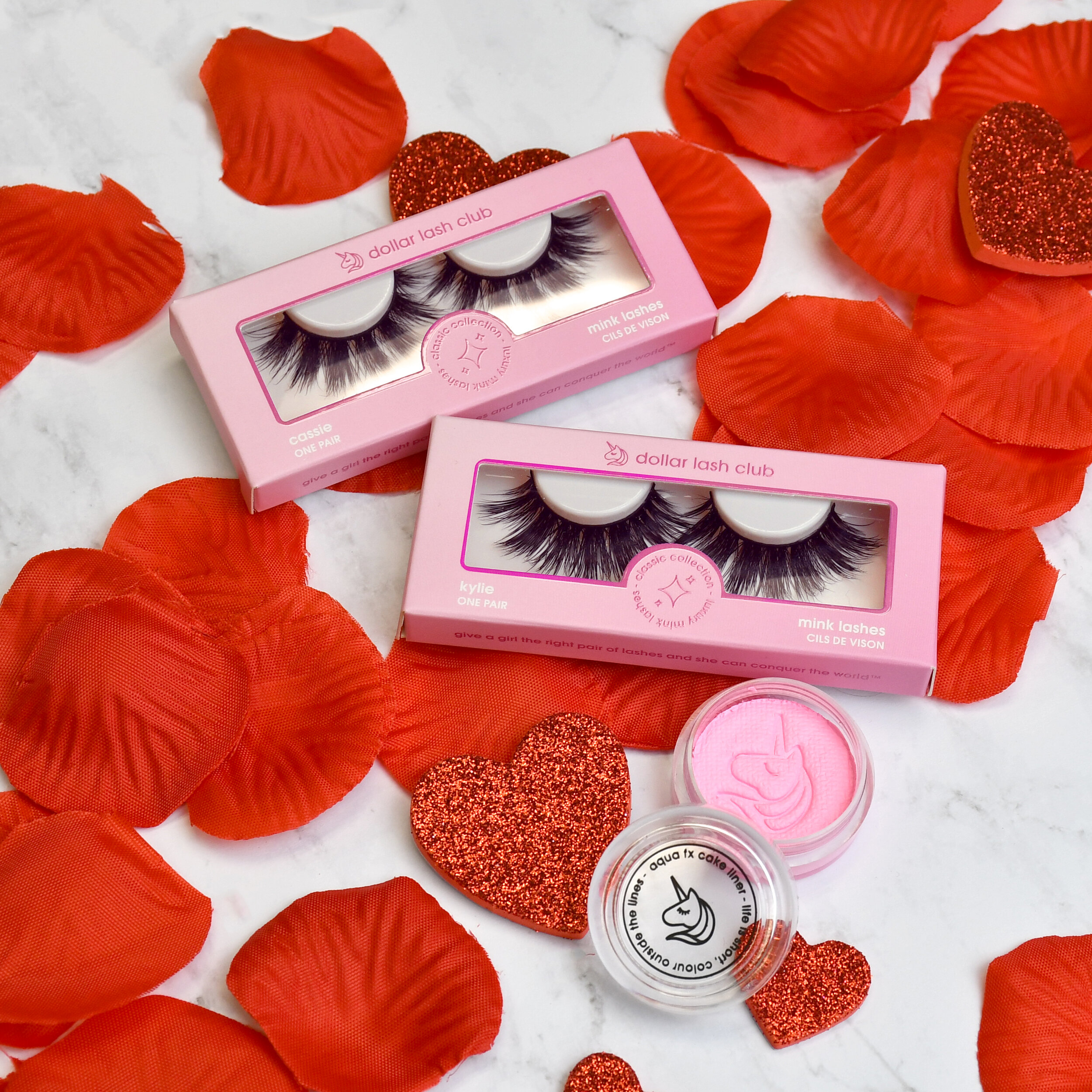
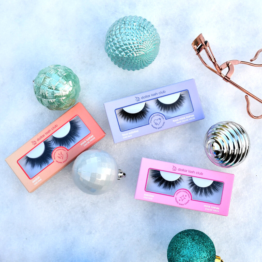
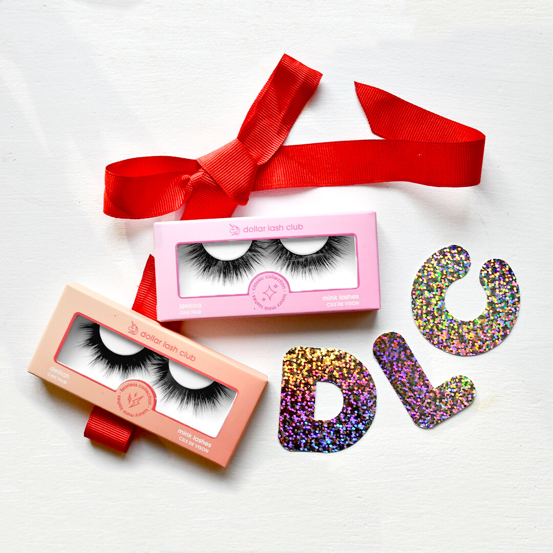
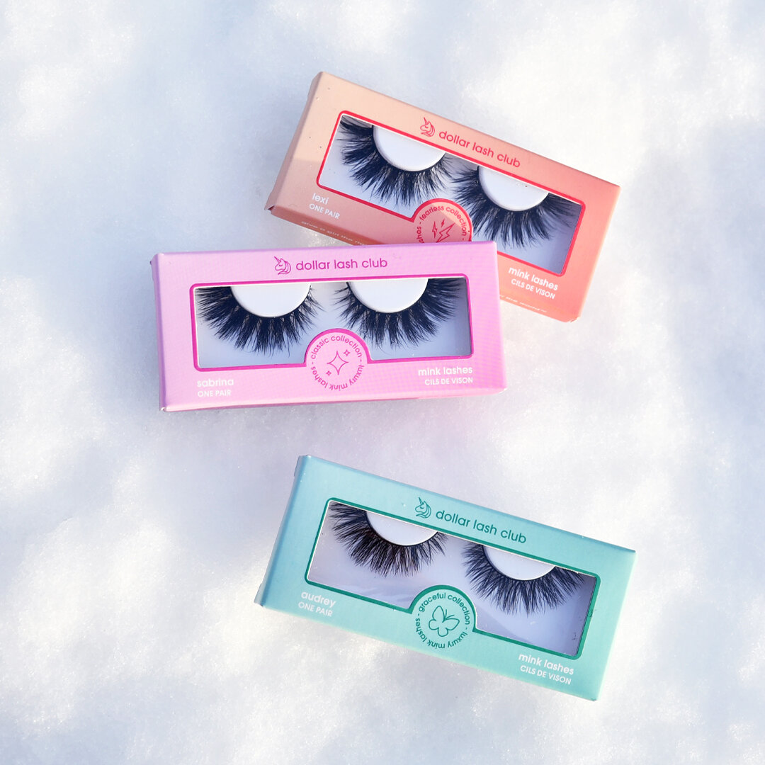
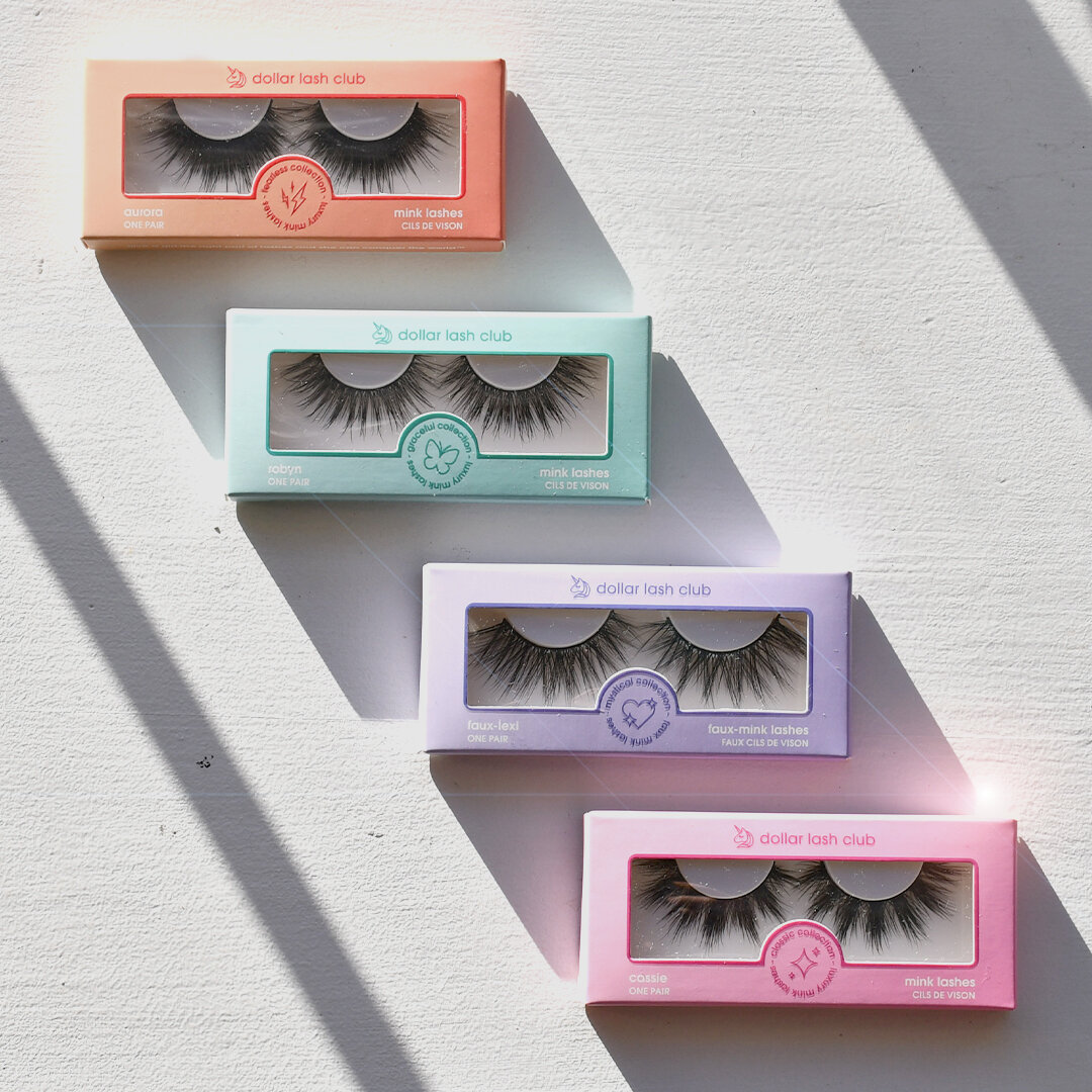
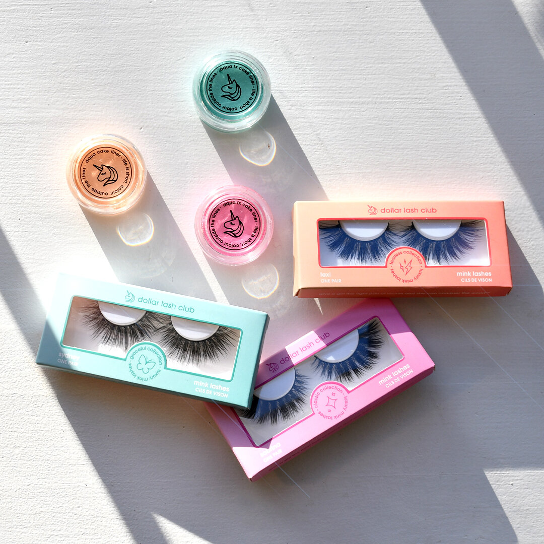
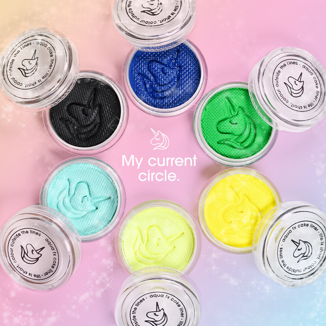
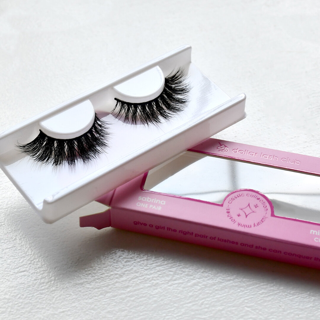
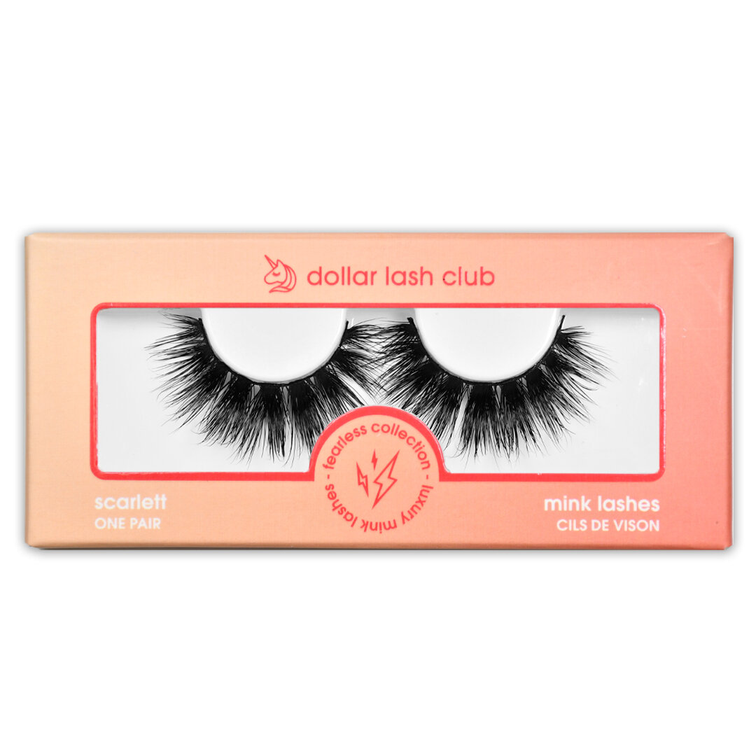
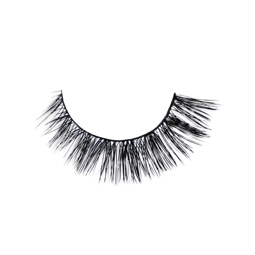
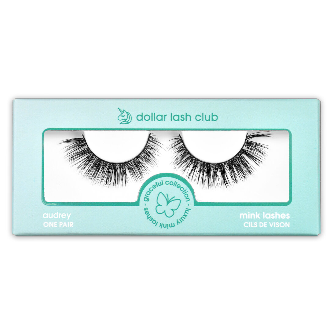
Packaging Design.
During my time here, I designed two packaging projects from start to finish.
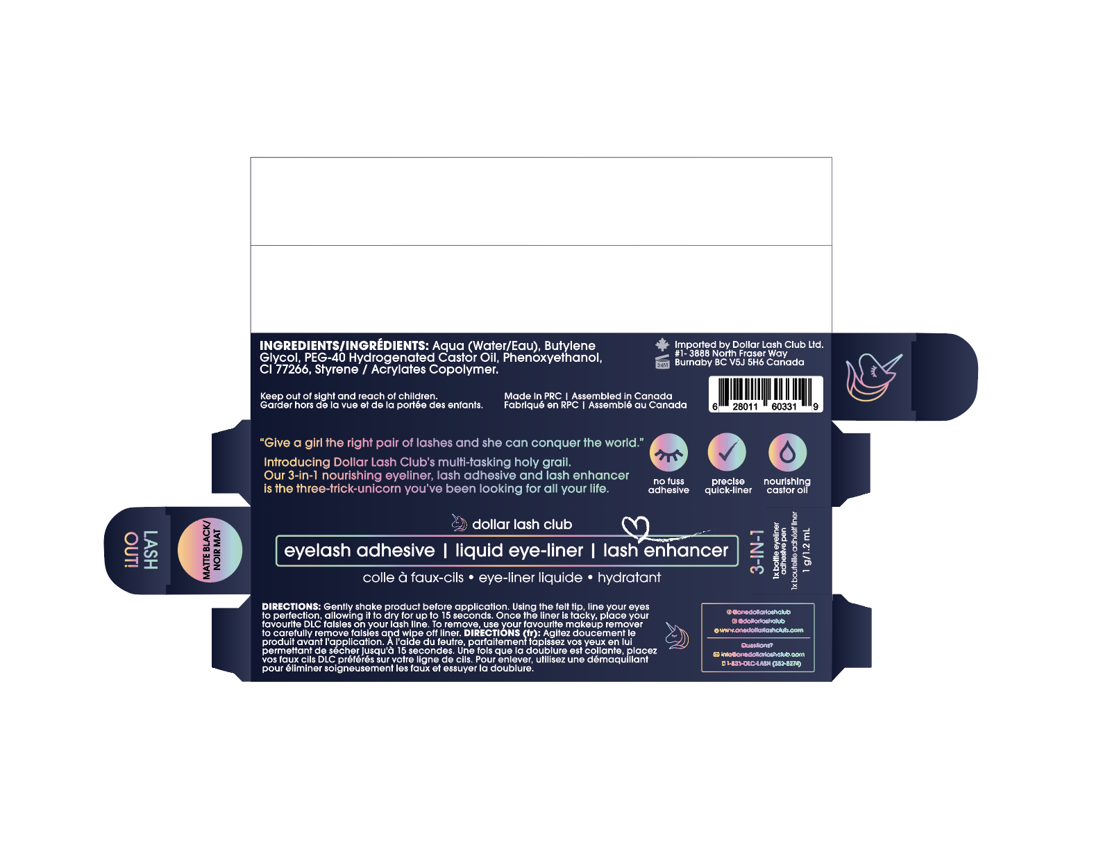
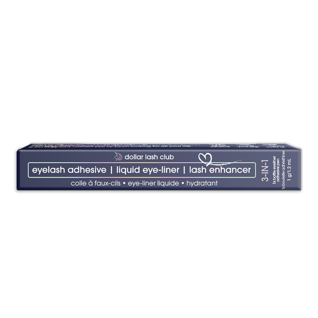
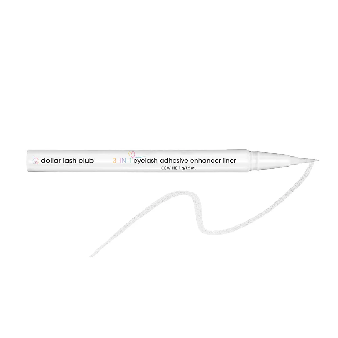
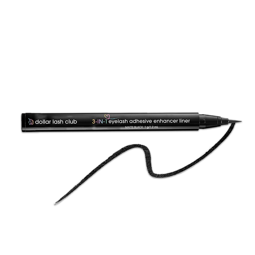
The first product was our 3-in-1 Lash Adhesive Eyeliner Pen, which unlike traditional lash glue, allows for false lashes to stick while providing an elegant liner look and has the added benefit of moisturizing your natural lashes with Vitamin E. This project involved coming up with the label on the liner pen itself, as well as the unit carton that the product was packaged in. Since this was my first packaging project I’ve professionally curated, my creative approach was to keep the product consistent to DLC’s overall branding, with an added illustrative heart icon to suggest easy application of the product and its 3-in-1 benefits.
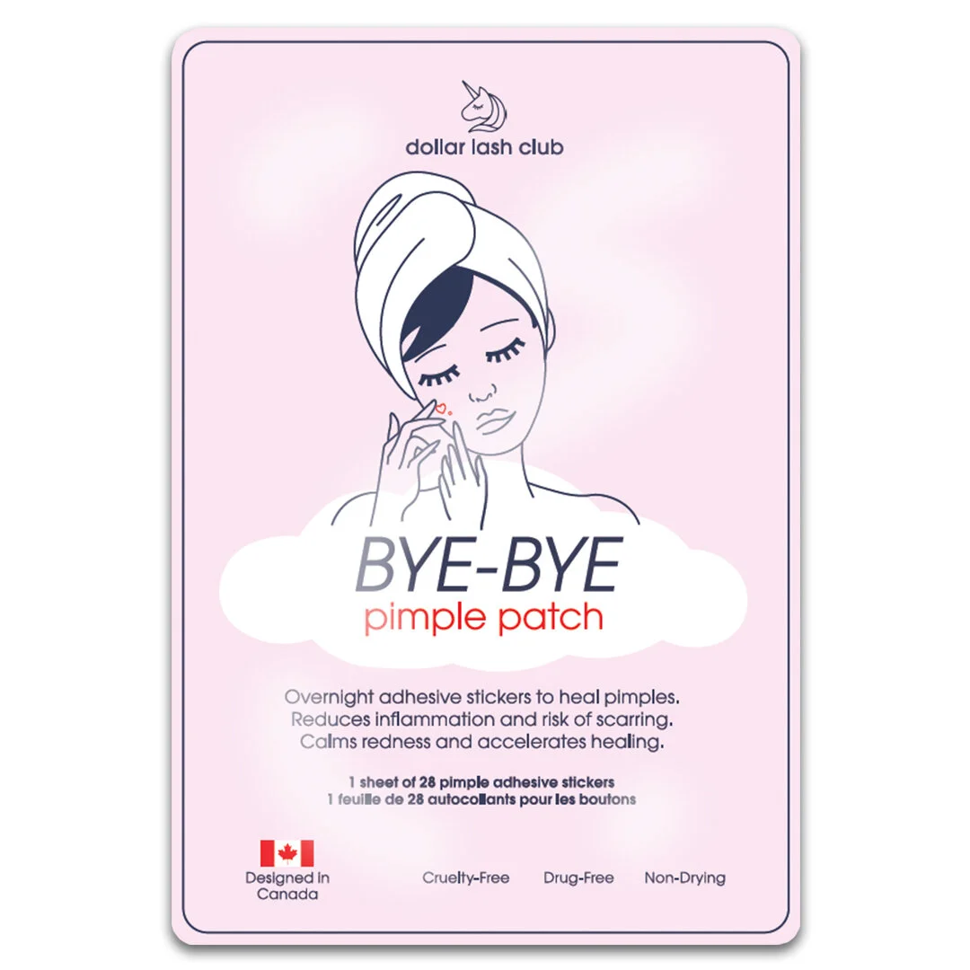
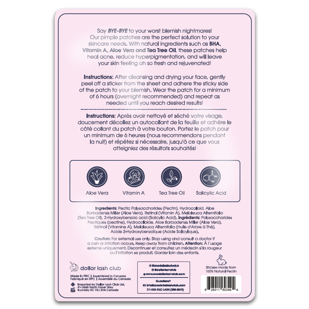
The second packaging design was for DLC’s Bye-Bye Pimple Patches. These little face patches contain anti-inflammatory properties + vitamins to help reduce the look of pimples, allowing them to heal quicker. With this in mind, our strategy to the product’s identity was to emphasize self-care. The method in which this was executed was through a minimalist approach to the design’s imagery and colour palette (we used DLC’s pastel pink, navy, white and touches of red), adding complimentary elements such as a cloud to suggest a dreamy quality (suggested wear is during the night as you sleep), and an illustration of a girl who has her hair wrapped as though she just came from the spa, applying the product with care. The packaging itself is a simple pouch design with a tear placement at the top to access the product, similar to sheet face mask packaging. The back side of the packaging includes an informational layout with icons of the featured ingredients, translated in both English and French.
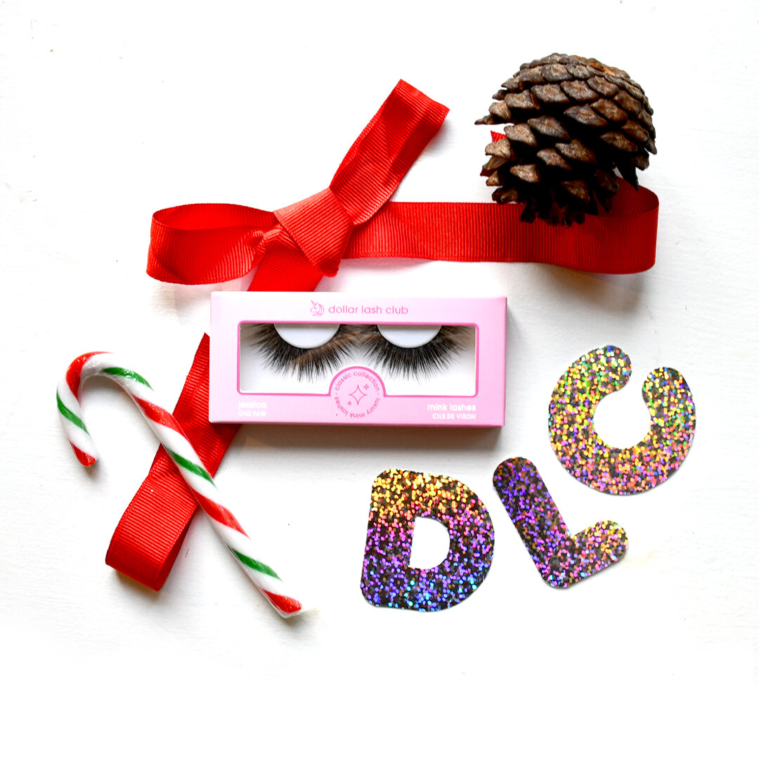
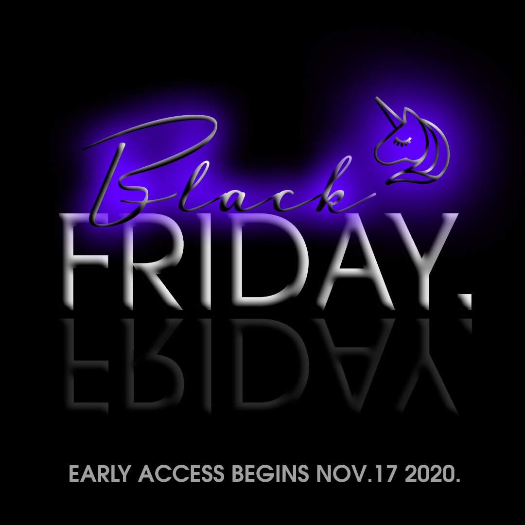
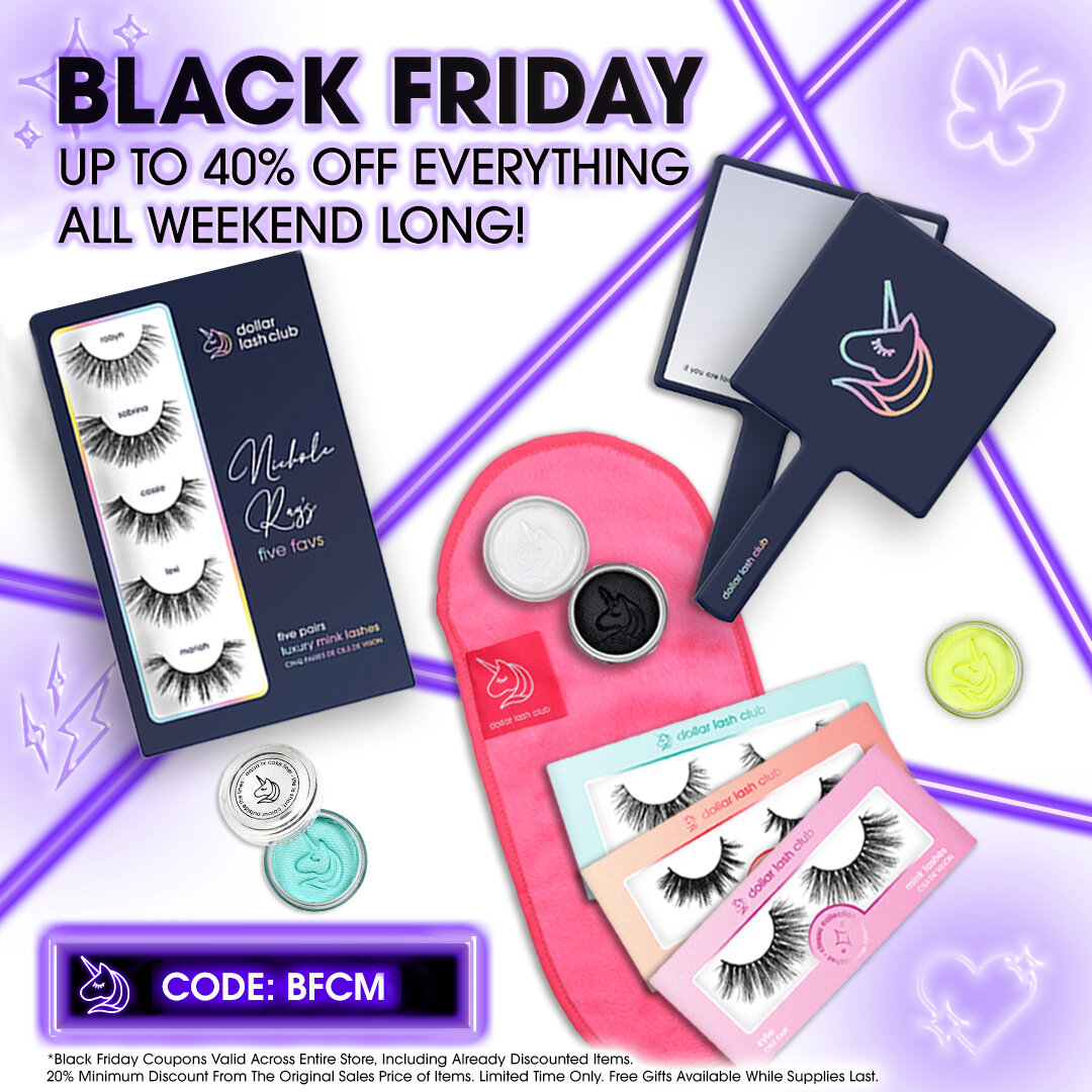
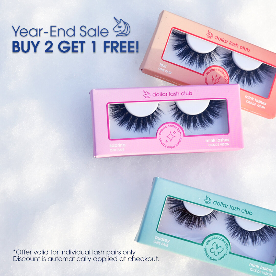
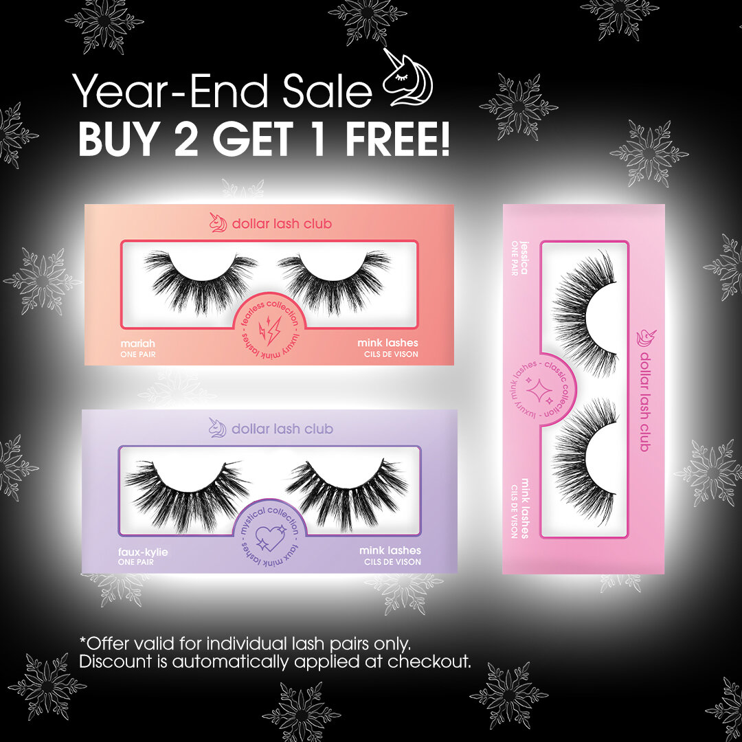
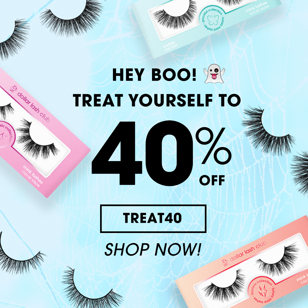
Campaigns.
The approach DLC uses to its campaign strategy is by implementing promotional offers to target new lead acquisitions, and depending on sales conversions we would adjust and test our promotional assets accordingly. In terms of creative direction for campaigns, majority would align with holidays, current events or other relevant themes for that specific promotion. We also work with affiliates and influencers to endorse our products, therefore the occasional affiliate campaign would be initiated as well.


Printed Marketing Material.
I had the opportunity to design printed marketing flyers and brochures that were sent off with each parcel. Within the span of 4 months, I worked on two smaller double sided 4” x 6” post cards, and a larger catalog roll-fold brochure that featured DLC’s extensive product range.


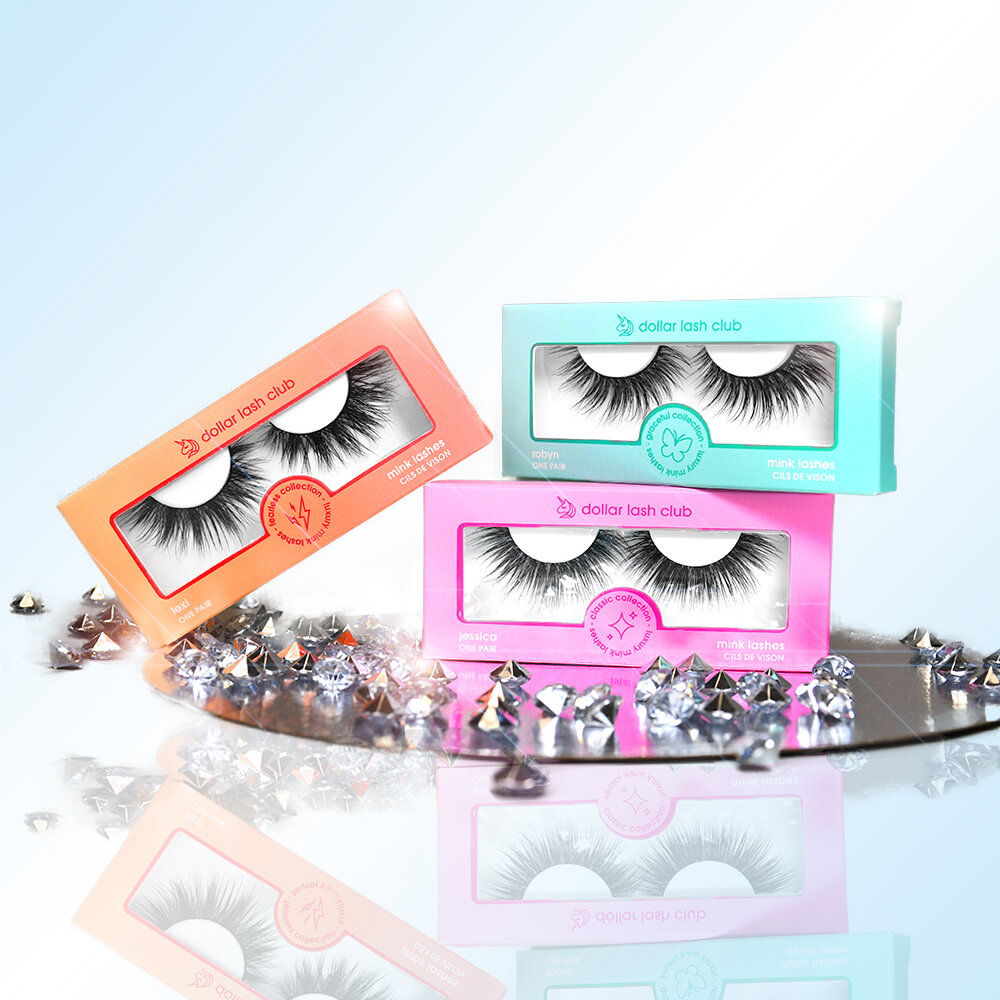
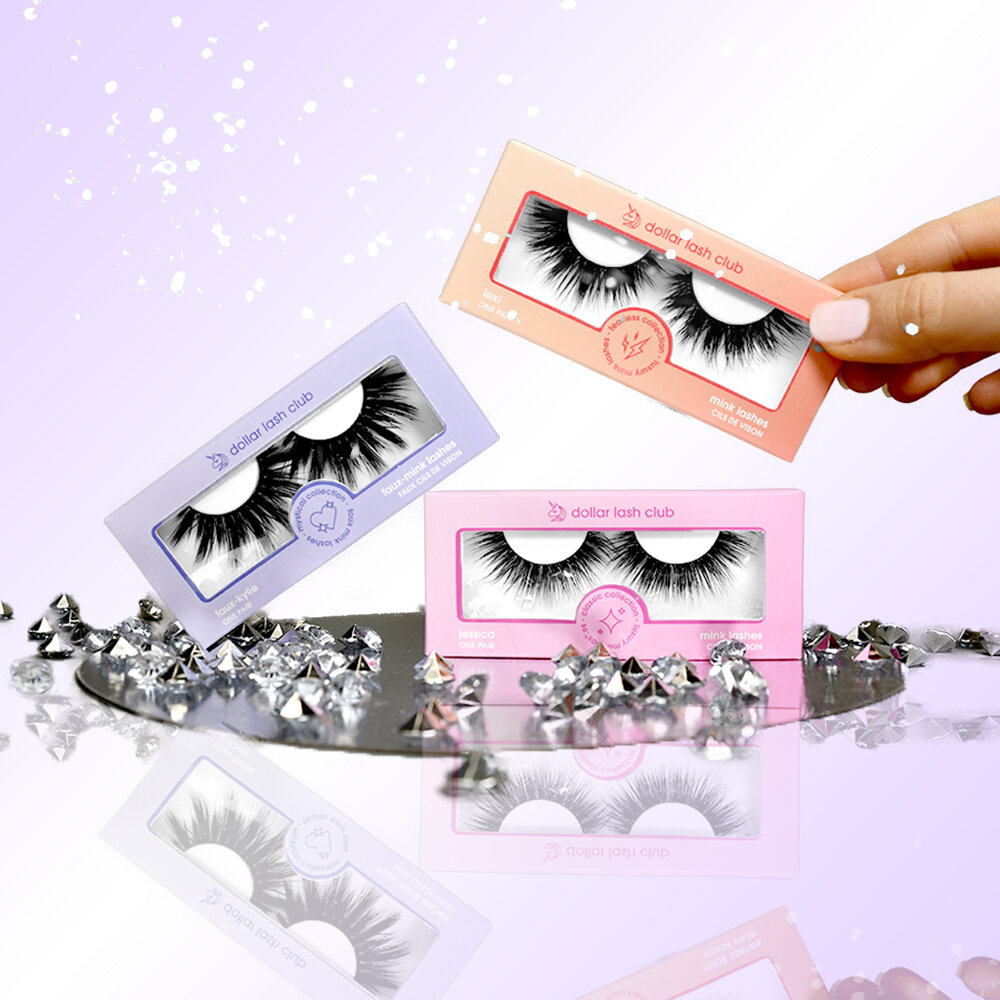
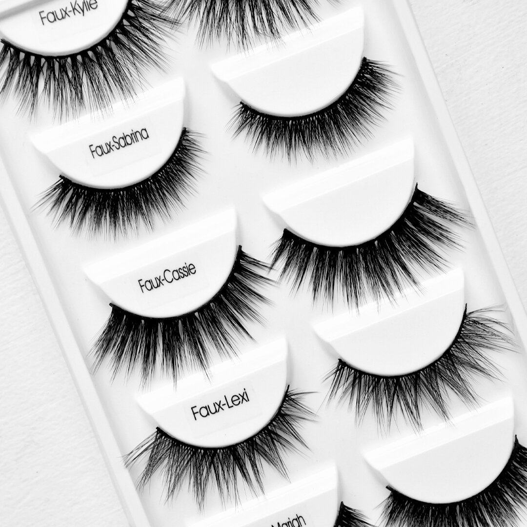
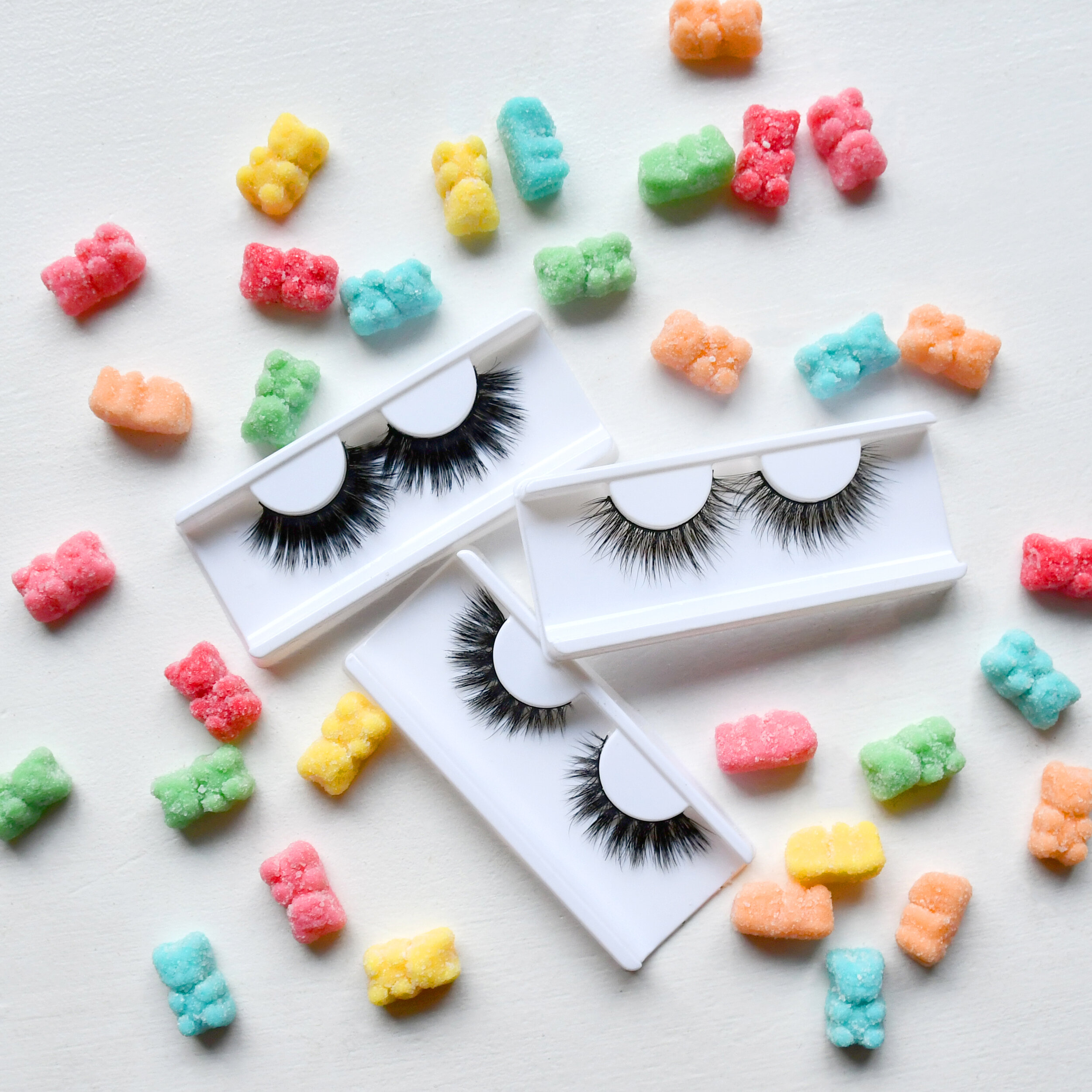
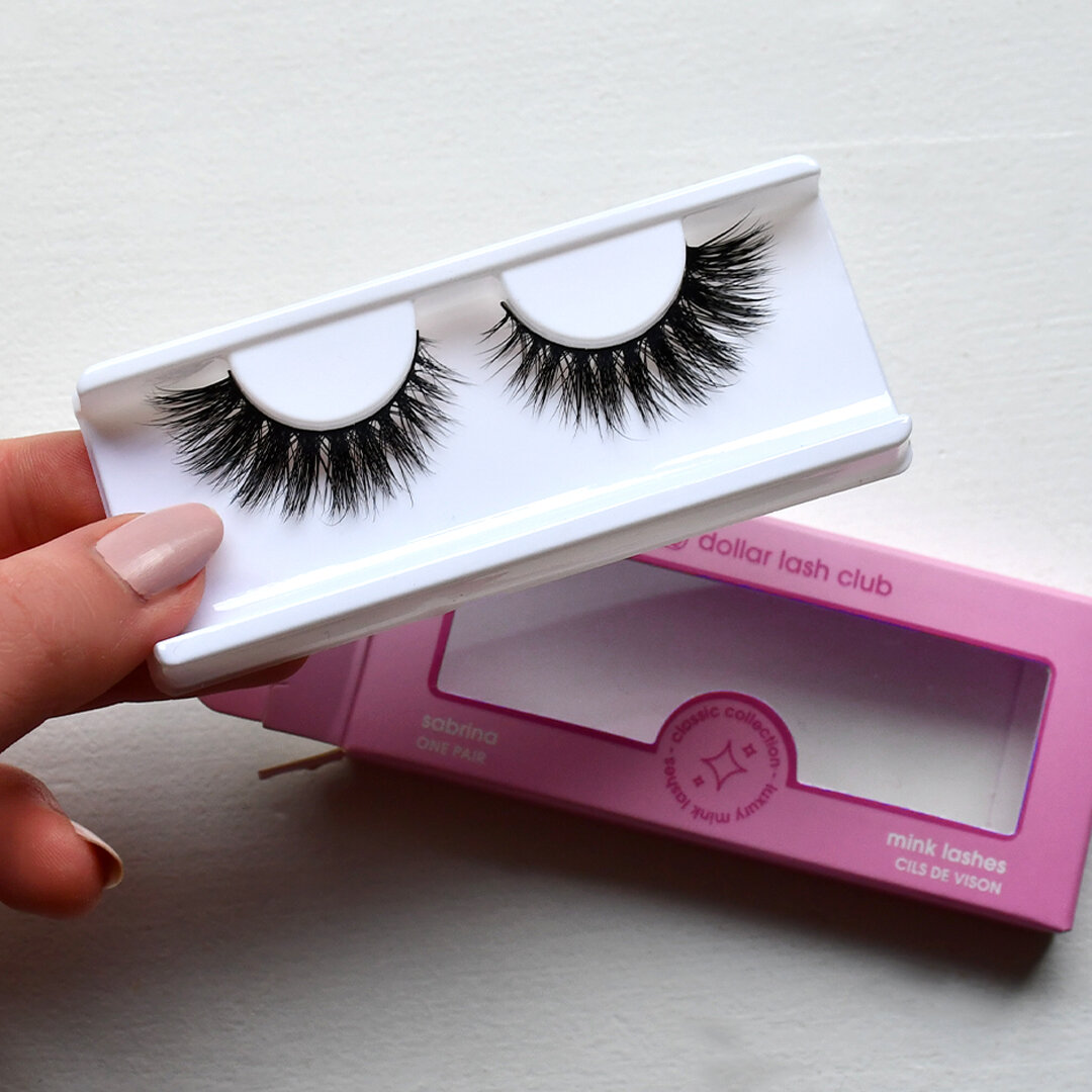
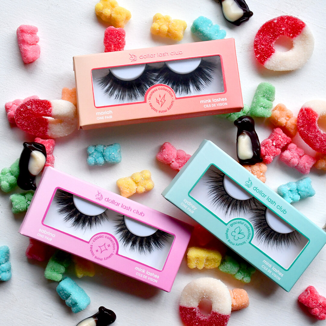
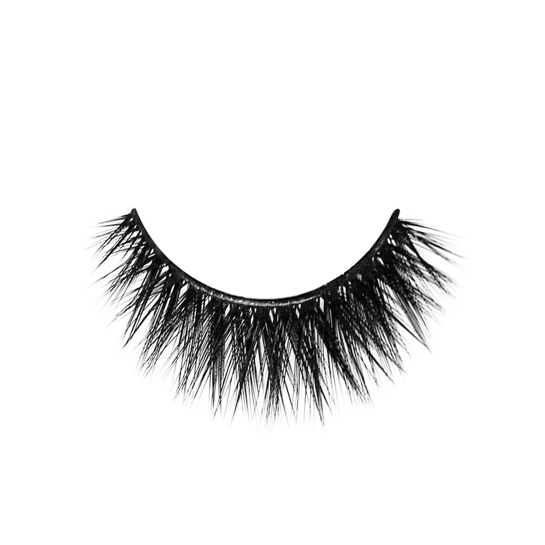
Product Photography.
A significant component to my role at Dollar Lash Club was updating our product photography for our website, flatlays for promotional or social media purposes and editing/retouching all images. Fortunately, I was provided with lighting equipment to utilize for product photography, however I found that I preferred natural lighting when it came to taking flatlays which I outsourced from home when I worked remotely.


Website + Landing
Page Design.
When I first started at DLC, the website was under a new development phase. For about 2 months, we went back and fourth with developers as they transitioned us to the new shopify layout, and I’m very grateful to have been part of that decision making process for the overall user experience and look/feel of the website.
Since launching the new site, I aided in the design process of a couple landing pages, specifically for our “$1 Lash Subscription” offer and our “Unicorn Rewards” page. Both pages required separate identities and information as they were new promotions, so I looked over the front-end design and layout, curated/created relevant content for each page and communicated with the company owner to complete their vision.

DLC’s “$1 Lash Subscription” Landing Page

The “Unicorn Rewards” Landing Page
Instagram Feed.
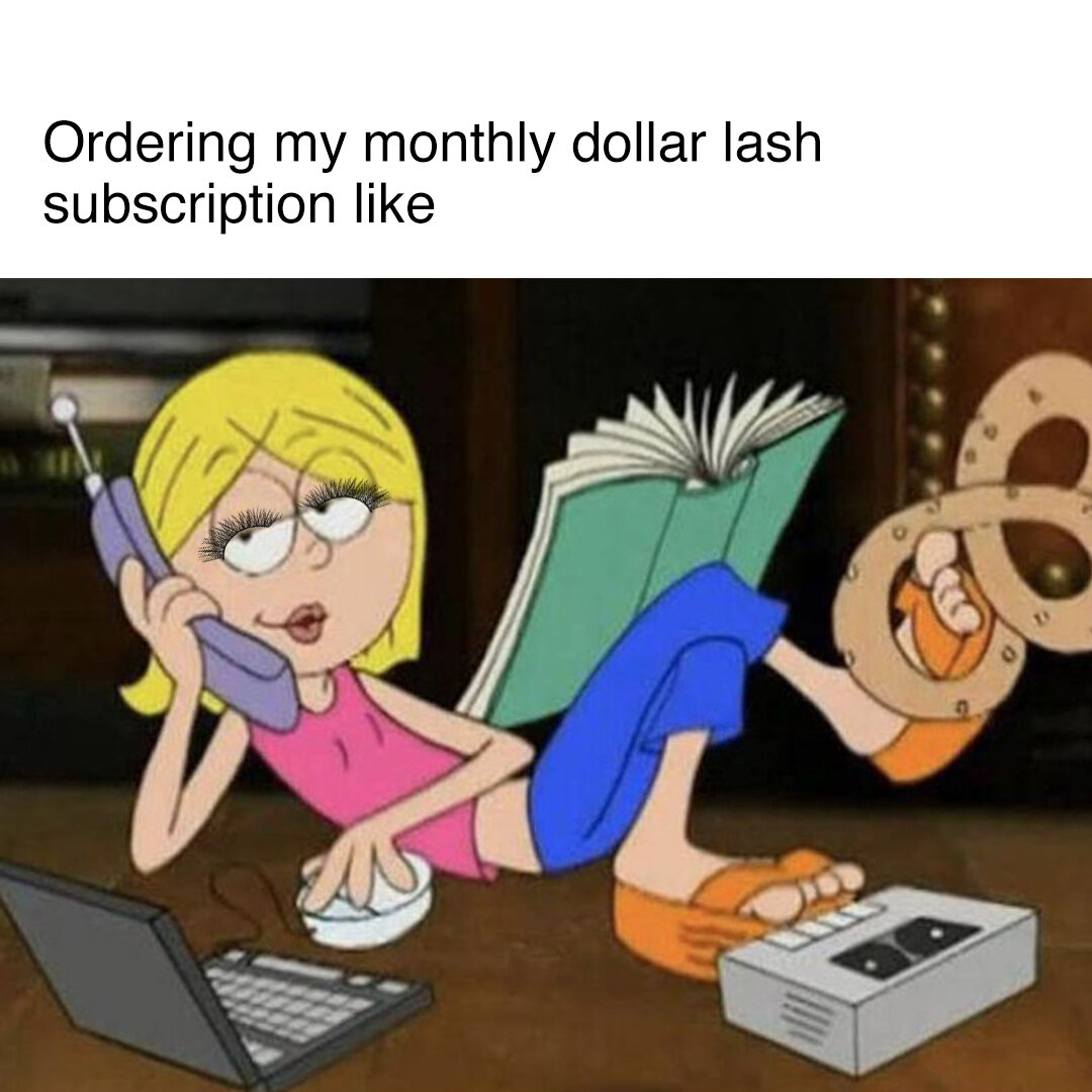
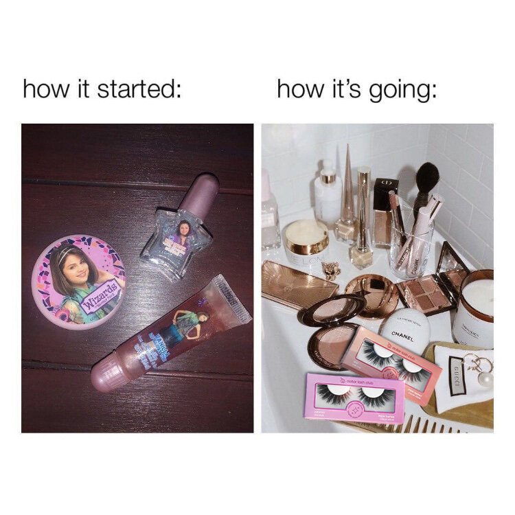
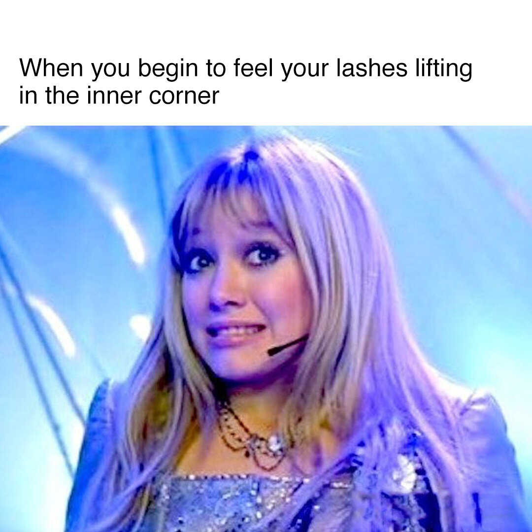
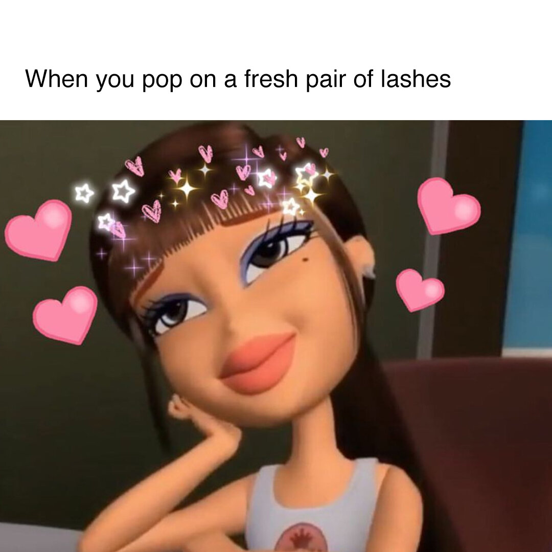
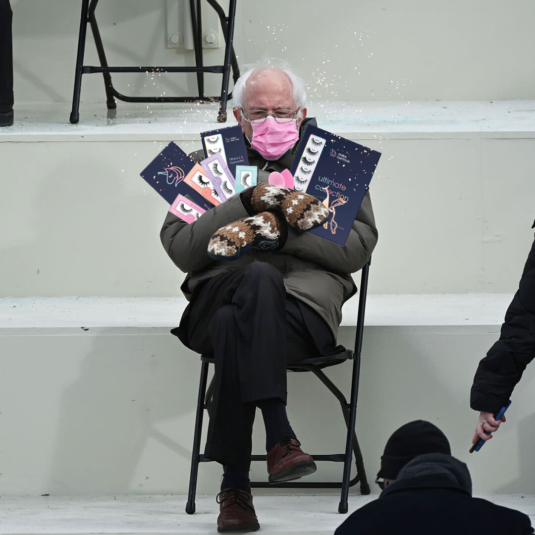
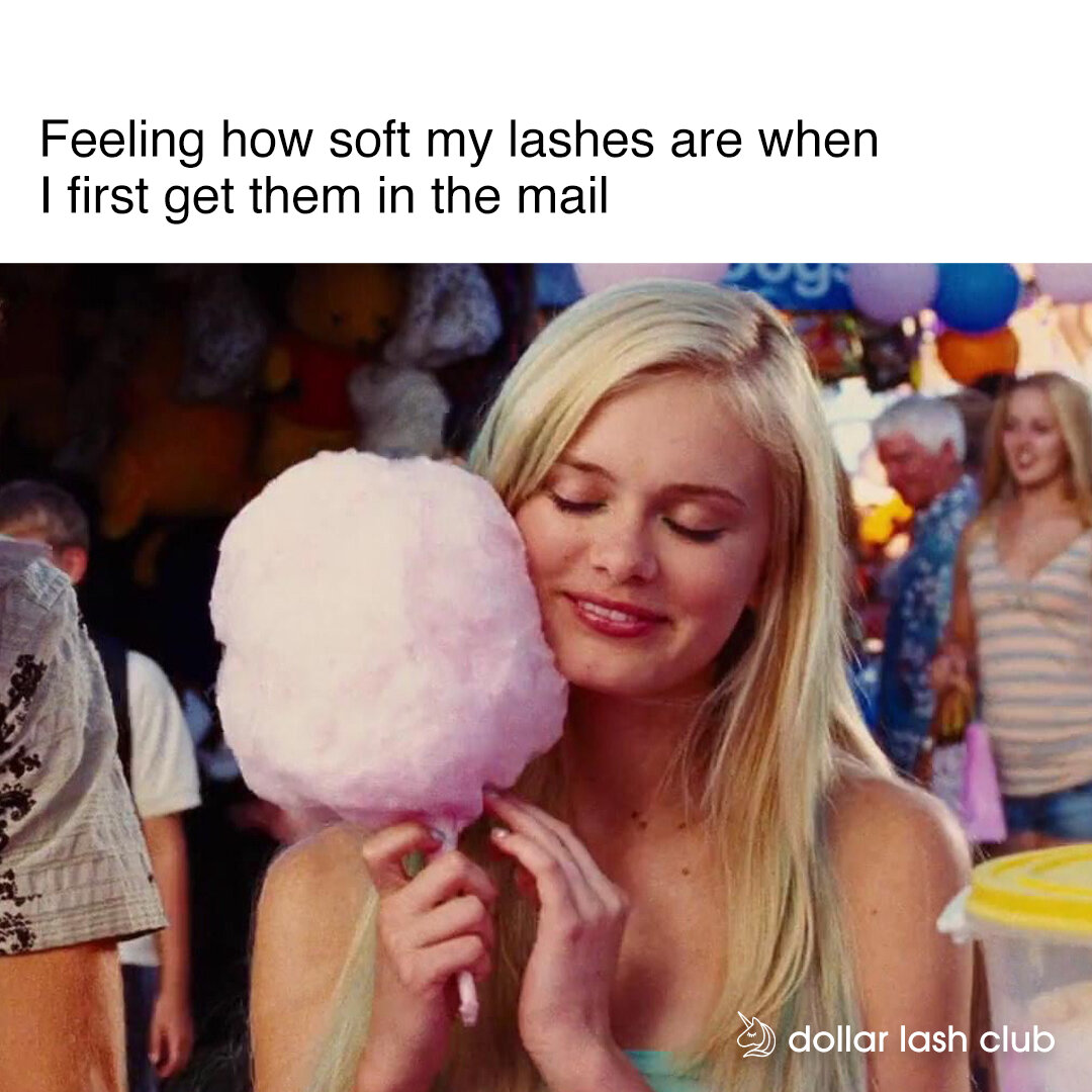
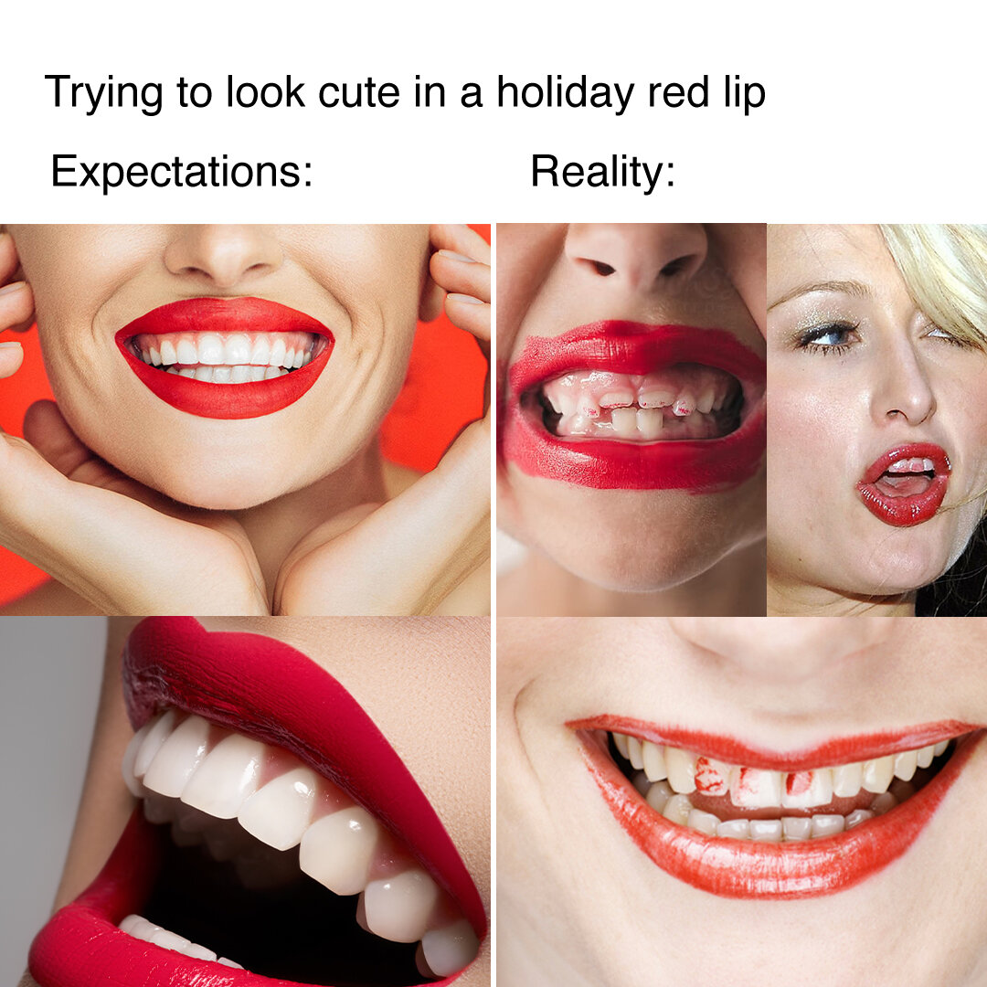
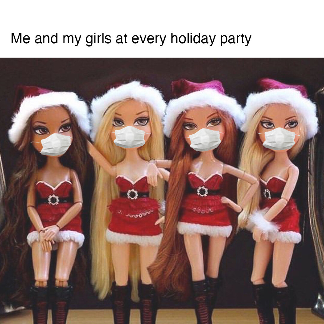
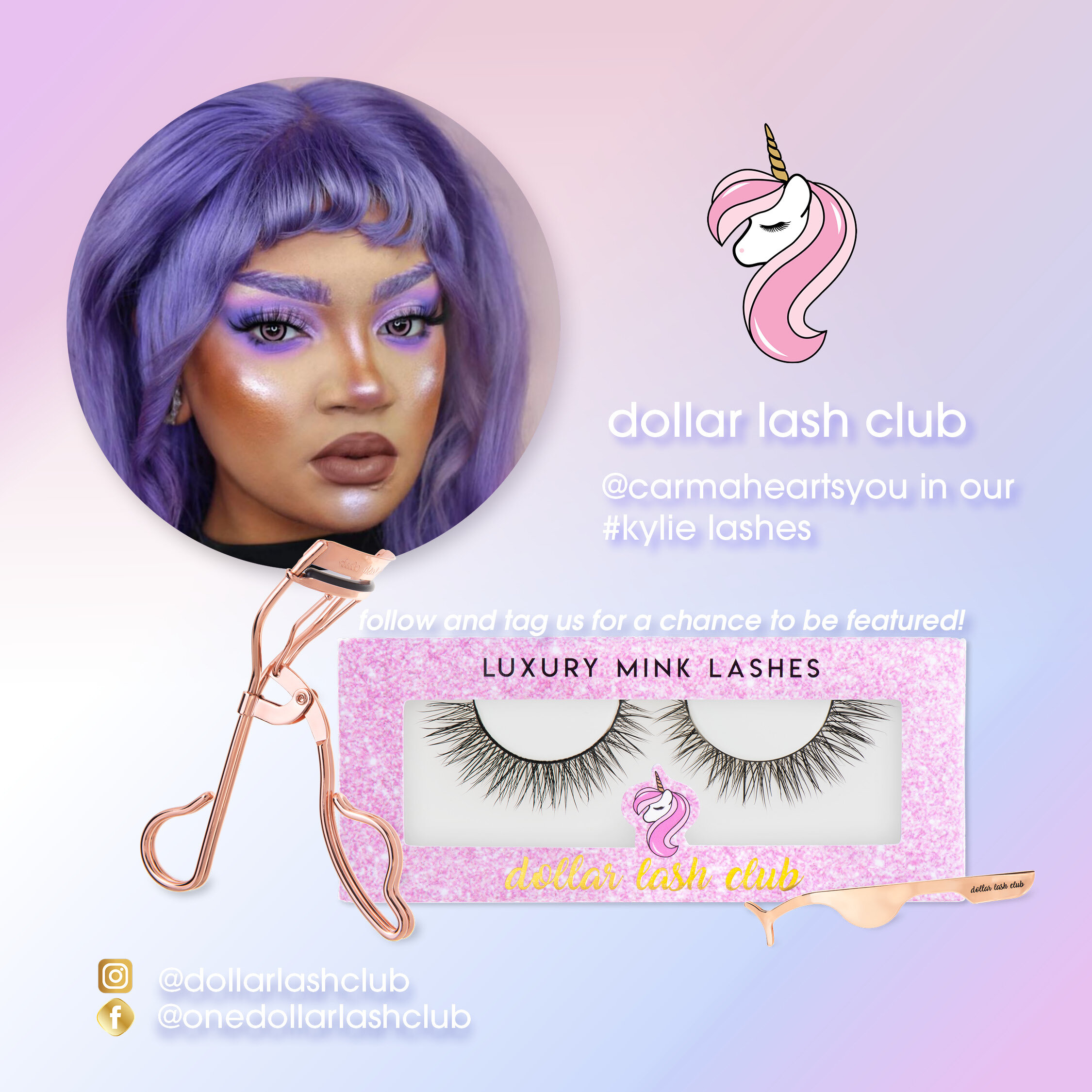
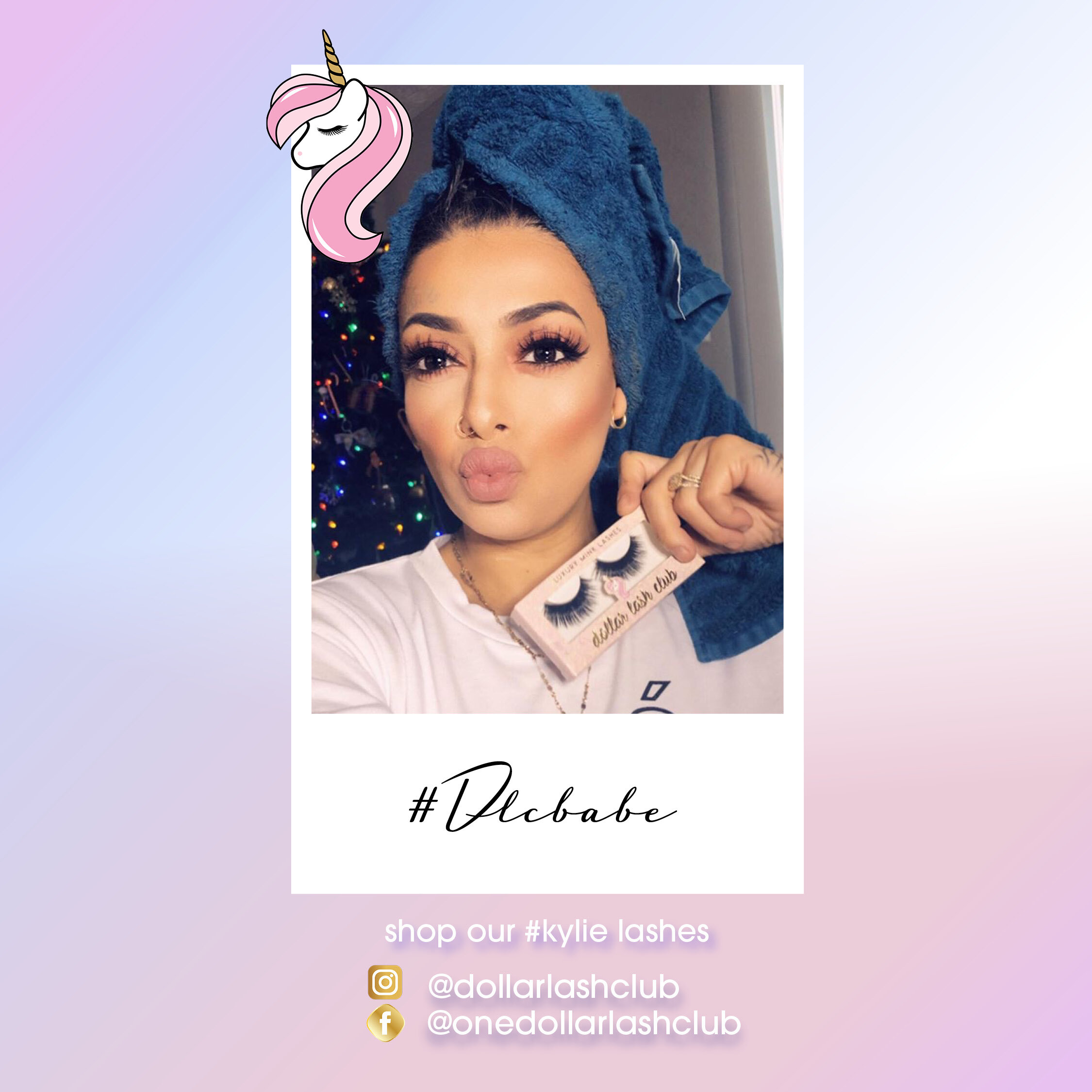
Another significant component to my role was scheduling, curating, writing descriptions and posting to our Instagram feed. I would create the grid layout in Indesign before scheduling our posts through Planoly, as we planned a month’s worth of content in advance. This was a lot of work as we posted 3 times per day, switching between user generated content (our influencer/affiliate posts), product flatlays that I would take, and relevant beauty memes to keep the customer entertained.
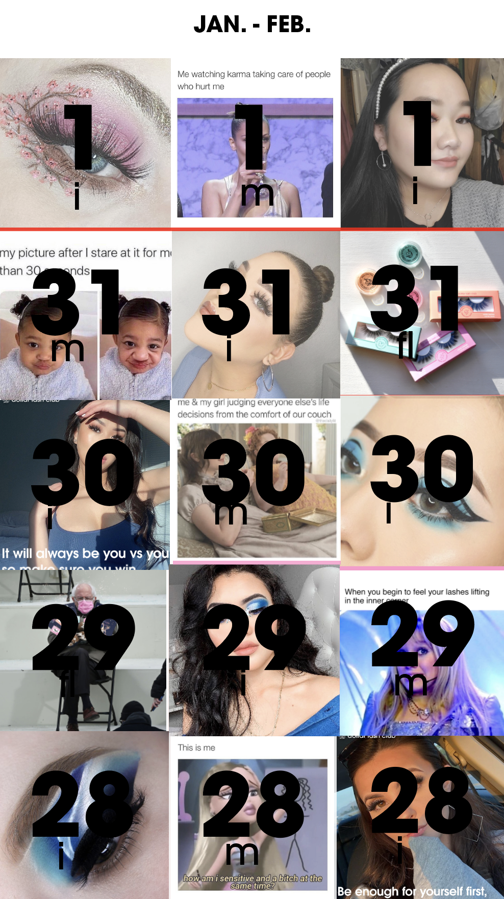
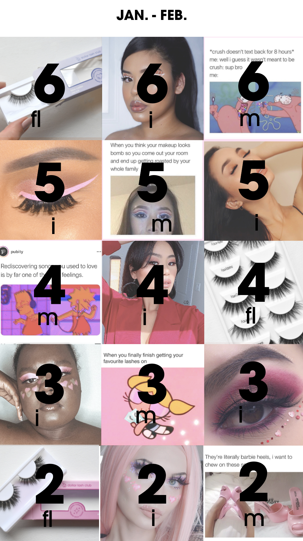
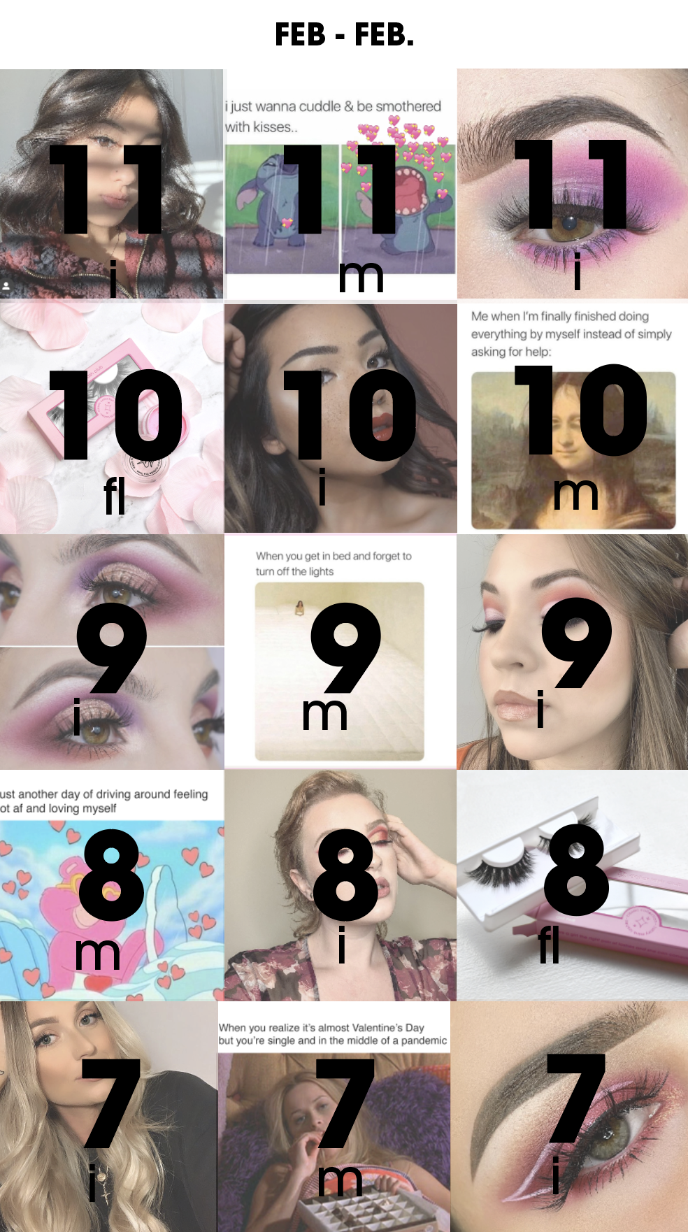
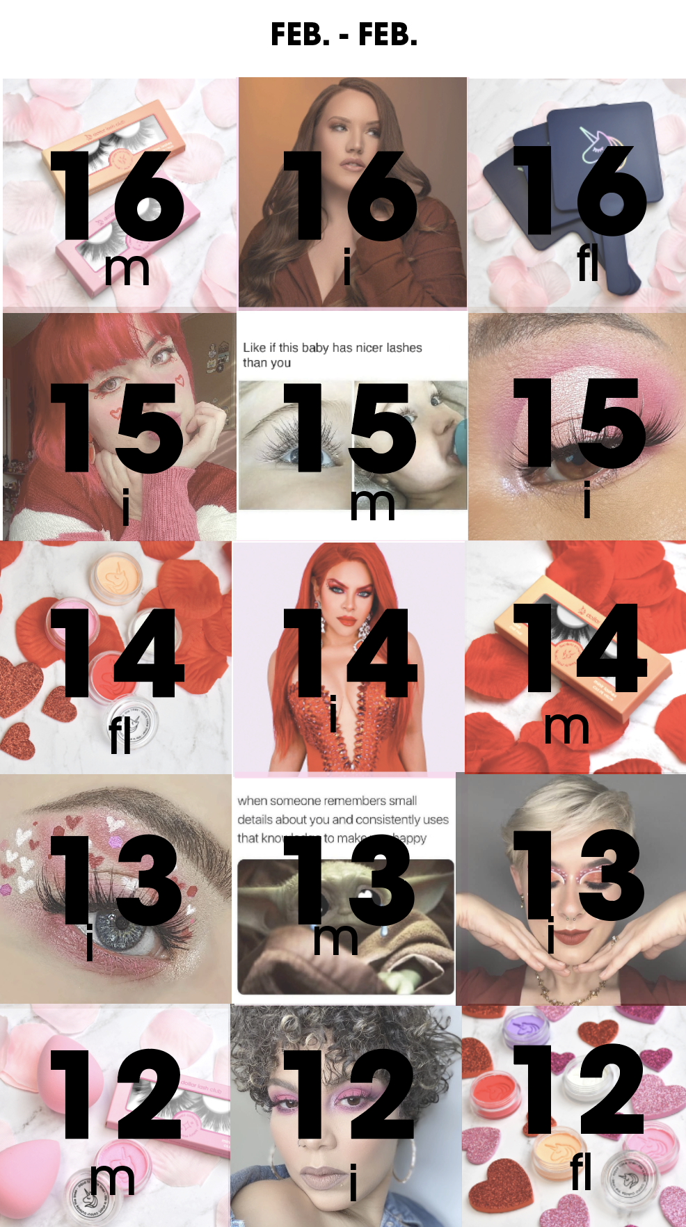
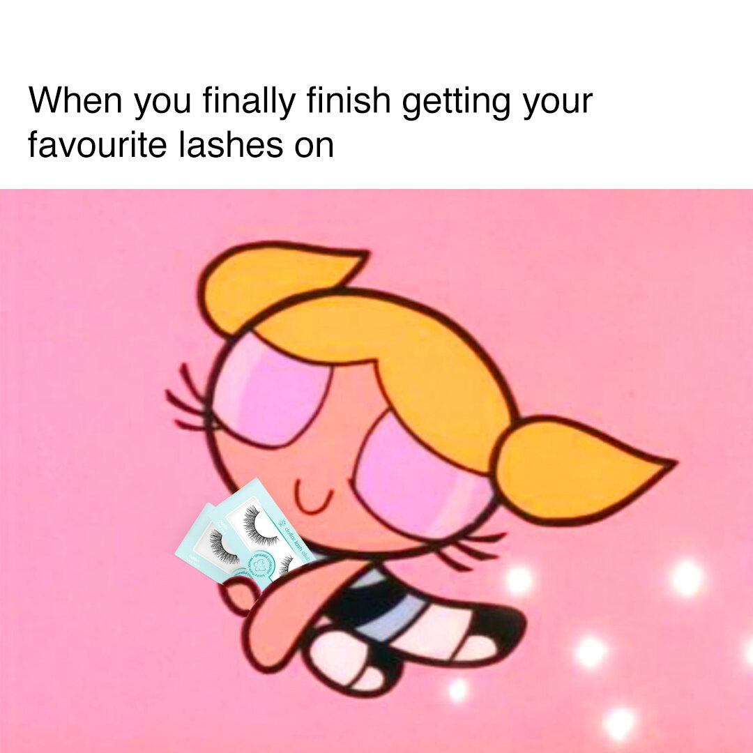
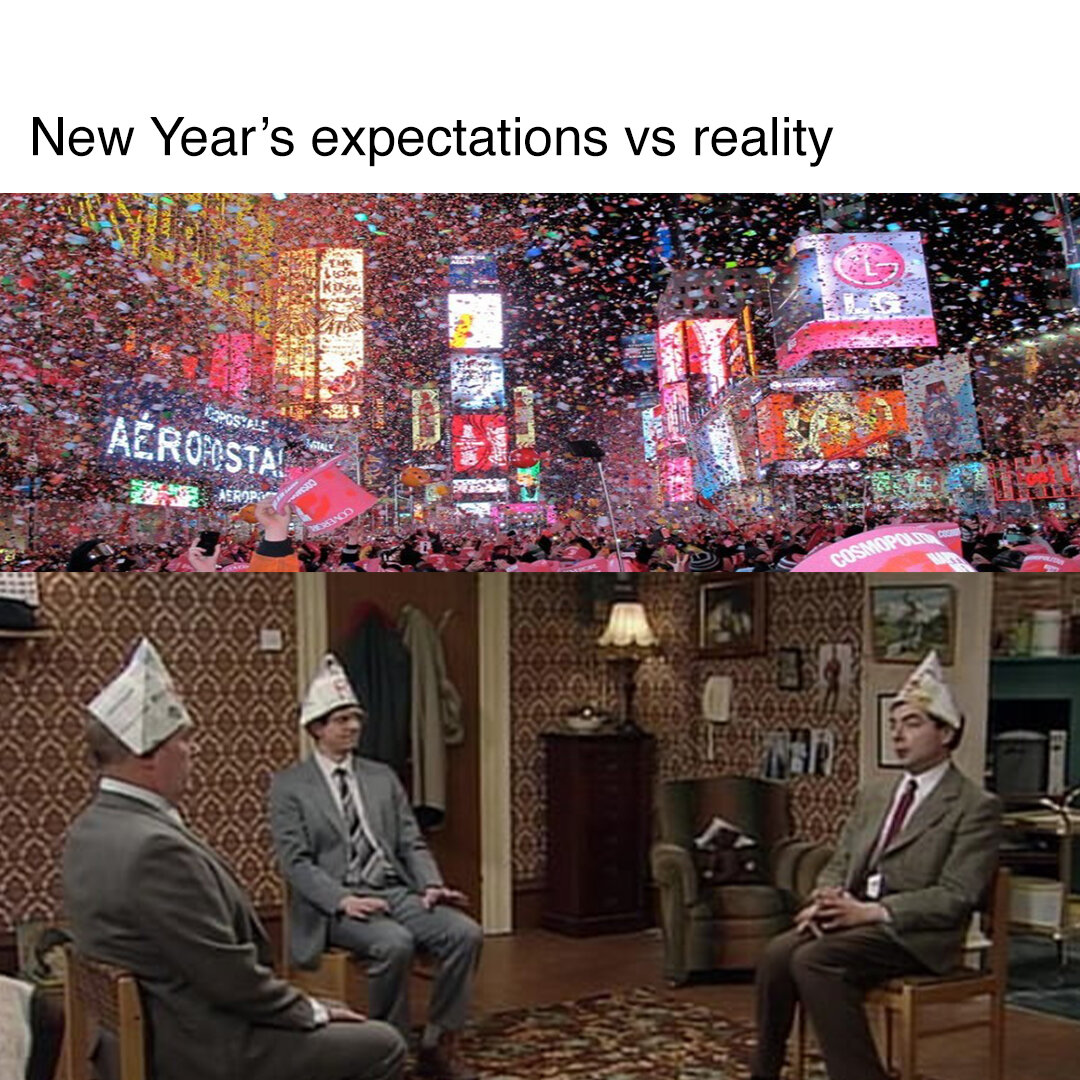
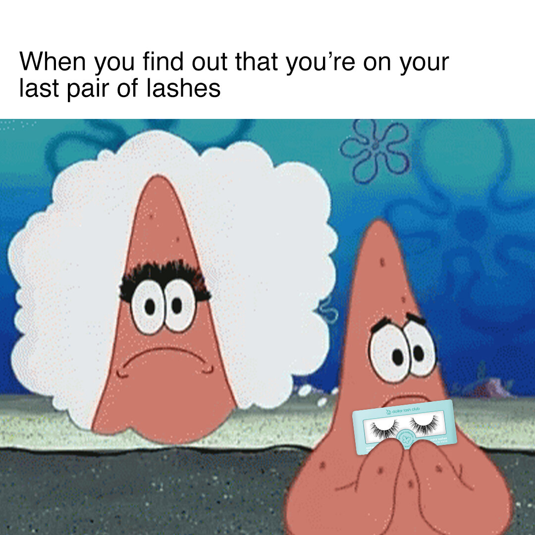
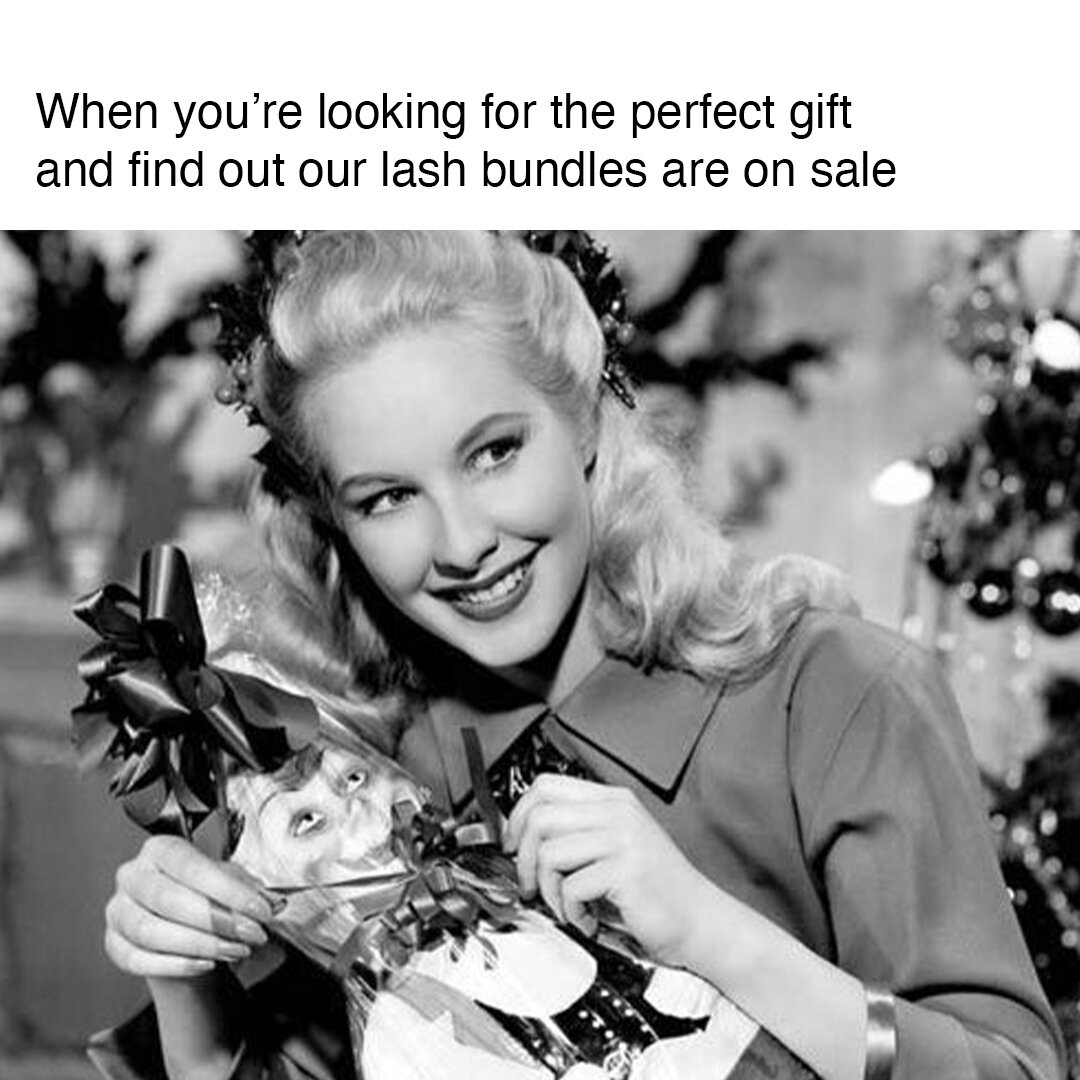
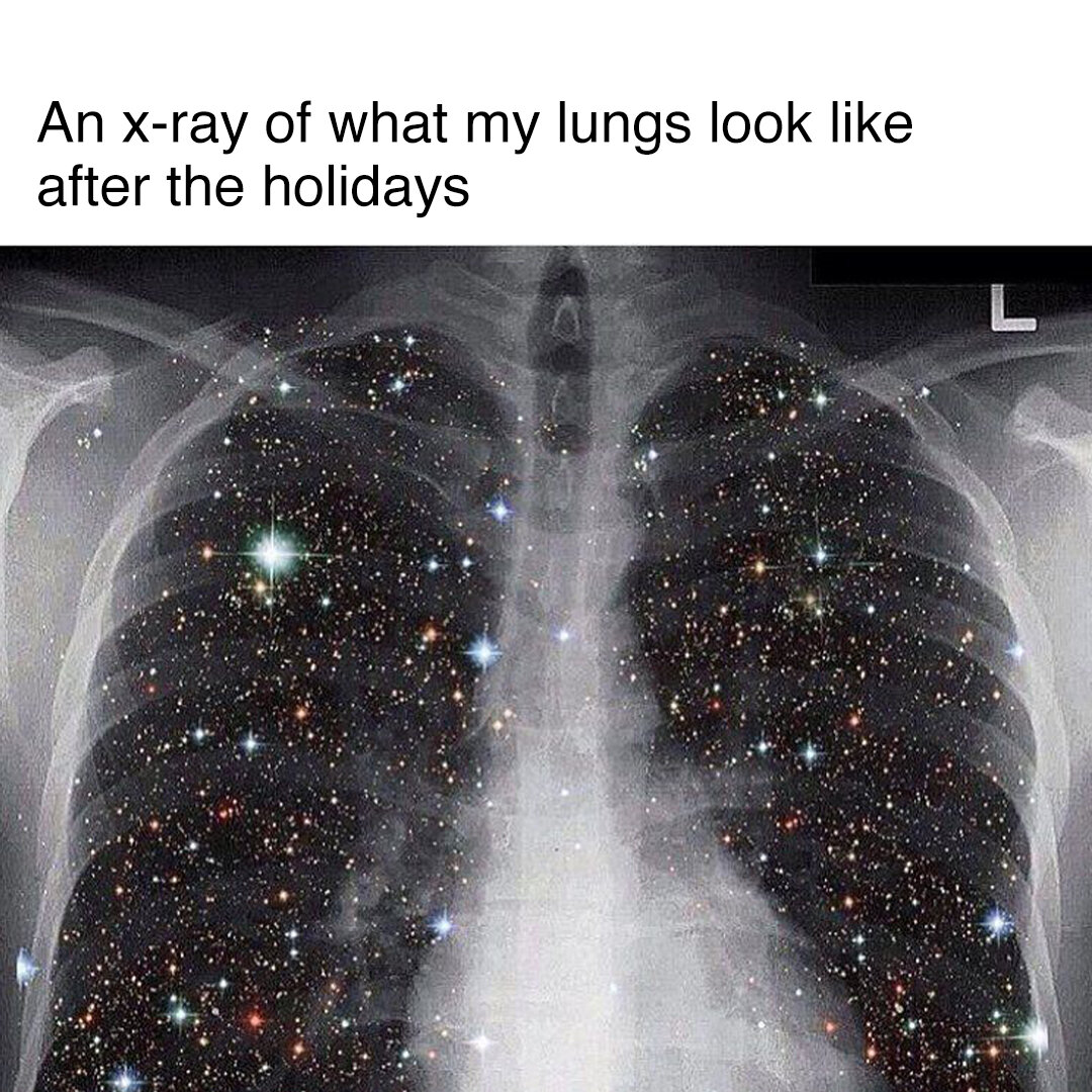
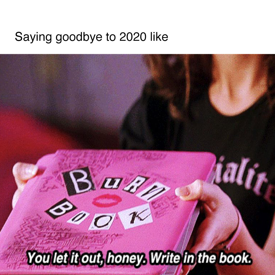
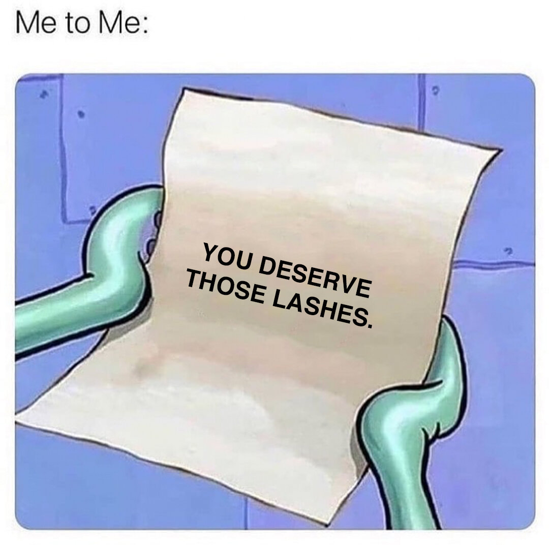
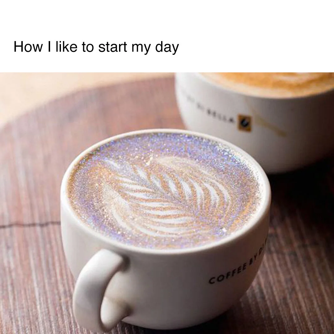
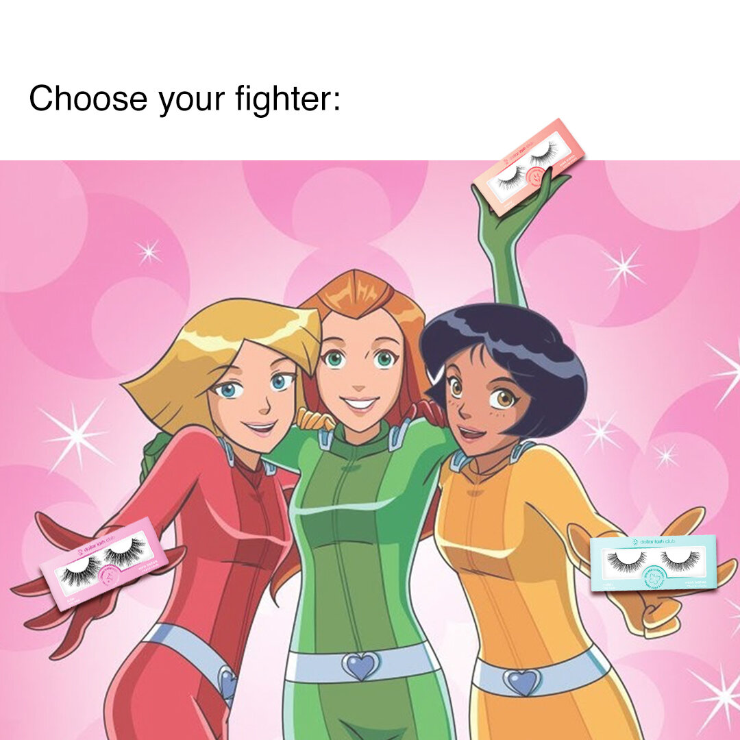
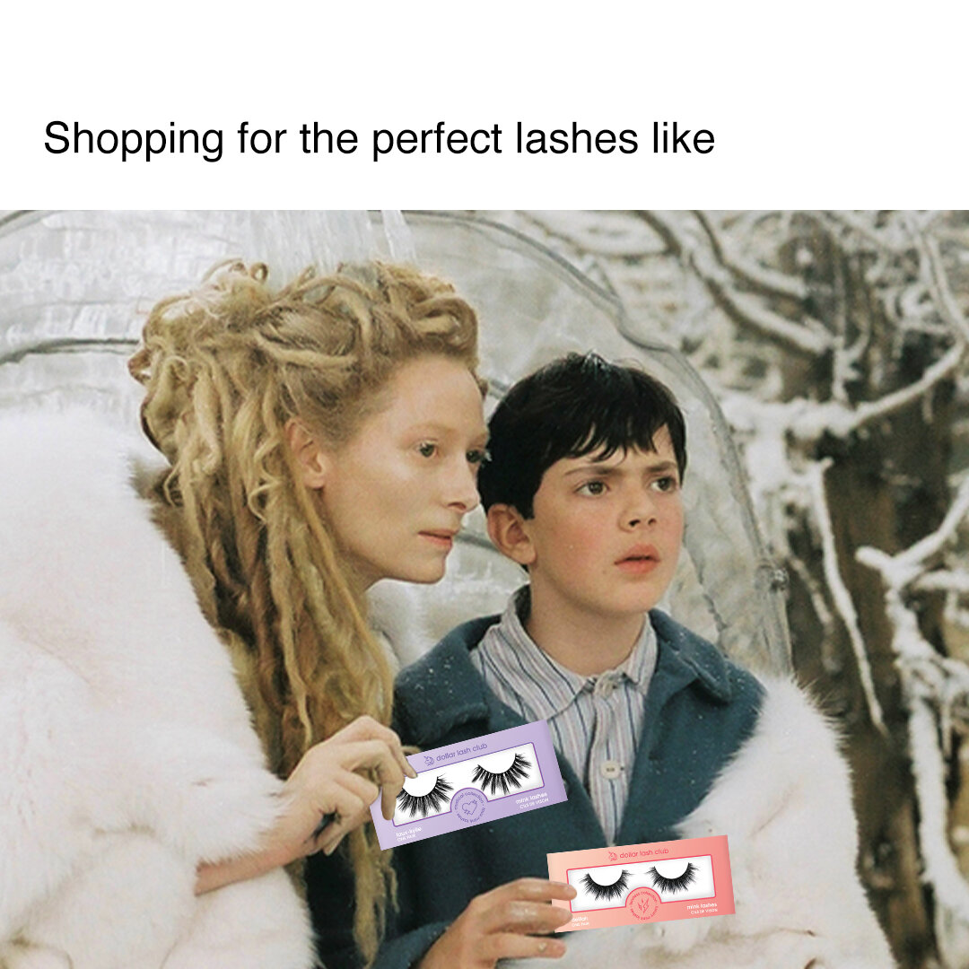
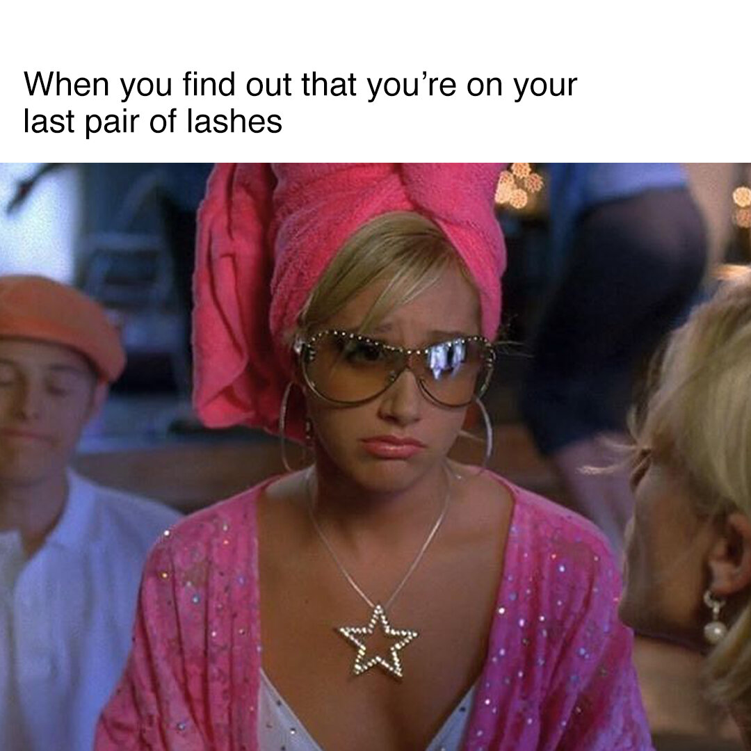
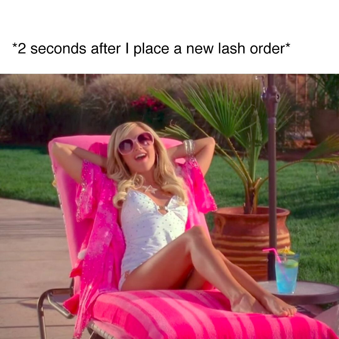
Oh, and you can’t forget the memes.