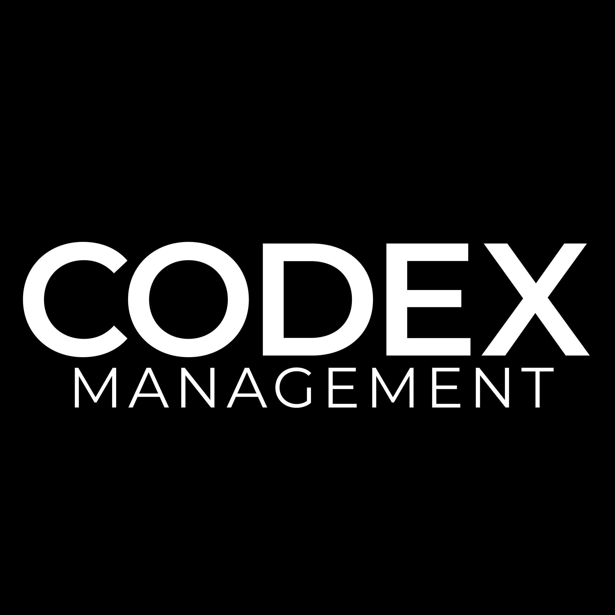
CODEX MANAGEMENT
Logo and Wordmark Design


I was connected to a client looking to re-design their existing logo for their Company, Codex Management. Based out of Vancouver, BC, CODEX provides construction management and consulting services with areas of expertise in pre-construction, development, project management, custom systems, template development and administration. They requested to have a few variations of the final logo to use across multiple platforms, therefore the final deliverables were provided as a logo variation package.
Below is the process for the entire project.
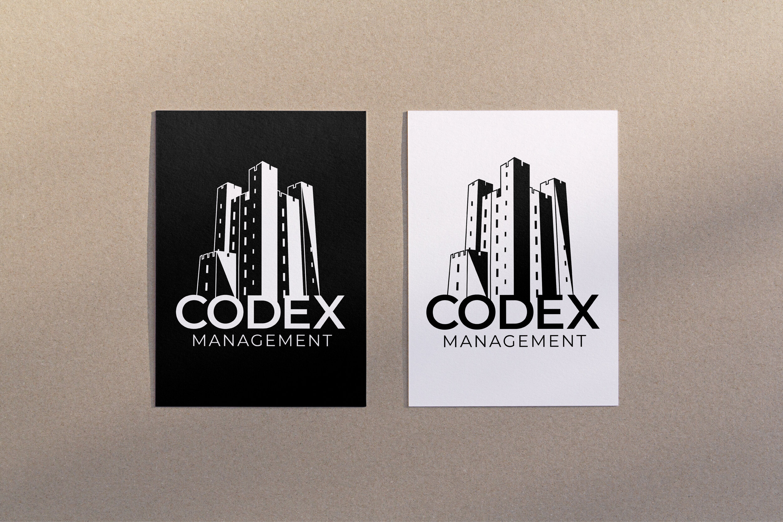
Original Logo
The original Codex logo consists of a Keep (castle/
tower) icon with an all-caps structured, block sans-serif for the text + word-mark. My client wanted to keep this image and concept, as the main goal was to simply clean up the design.


Precedents

The beginning stages for this logo design began with sketching, researching existing logos using the name Codex and coming up with a visual mood board with more ideas to draw inspiration from.

Existing logo precedents and brand/competitor analysis

Moodboard + Inspiration

Typographic Analysis and Further Conceptualization
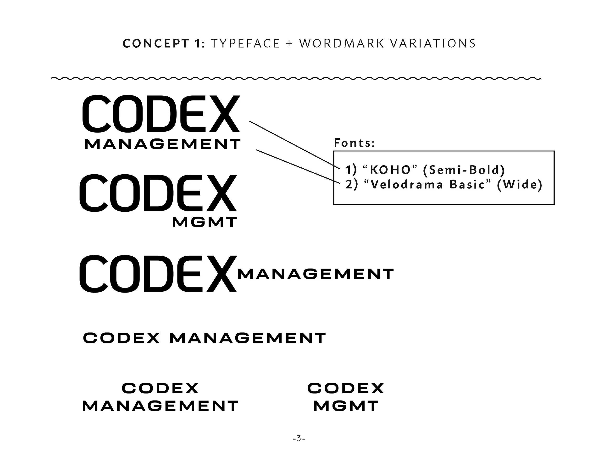
4 Concepts
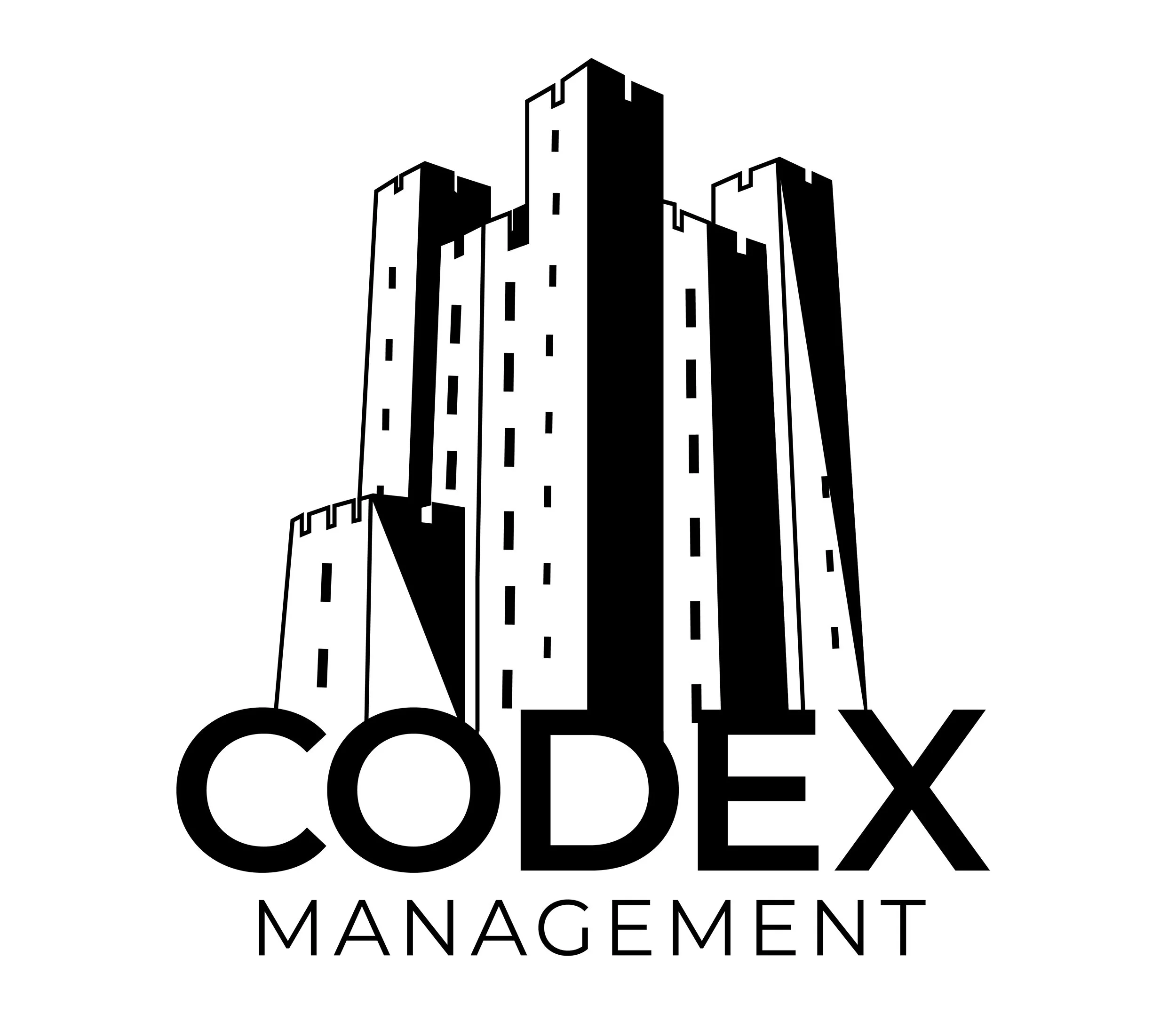
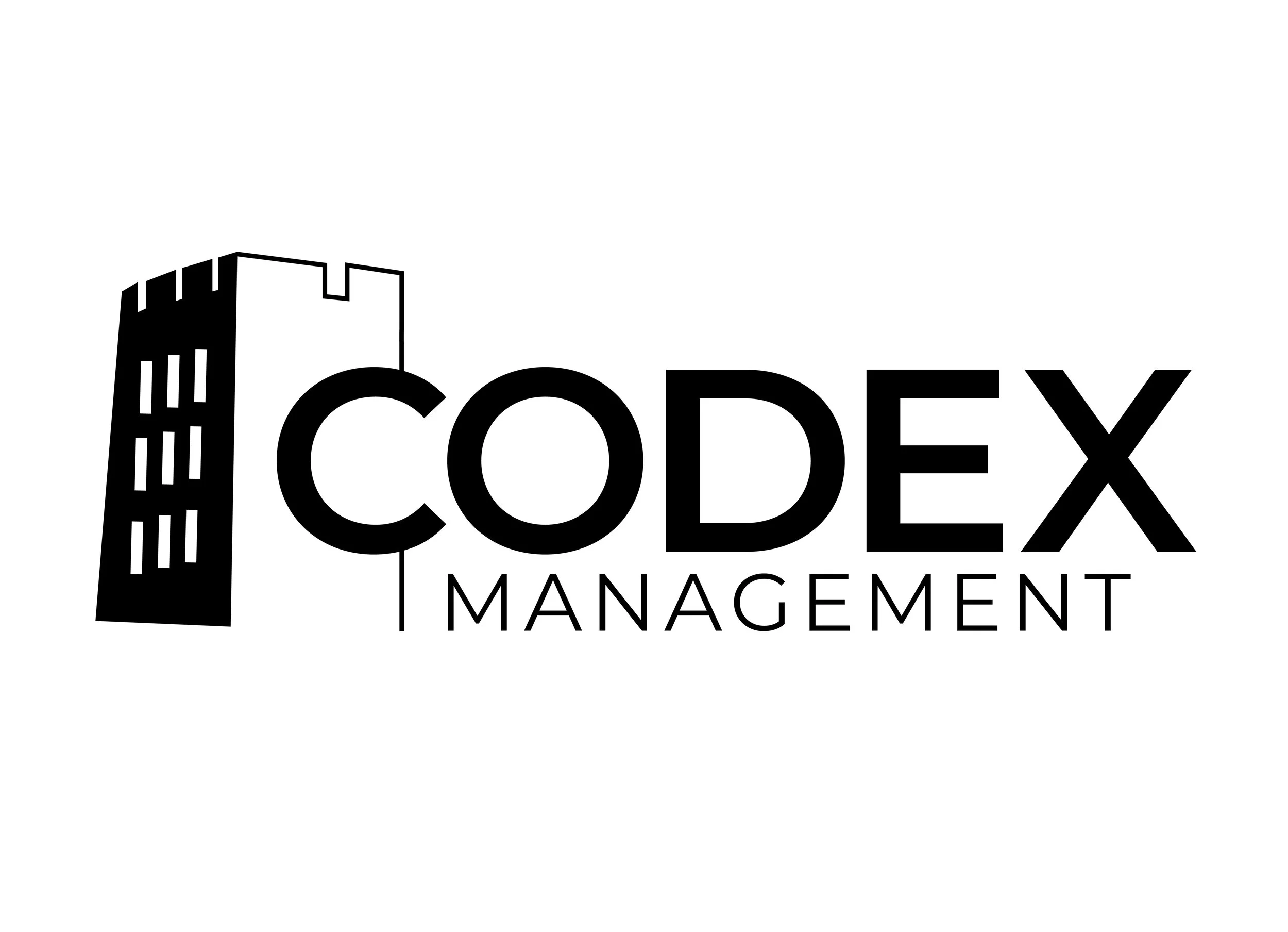
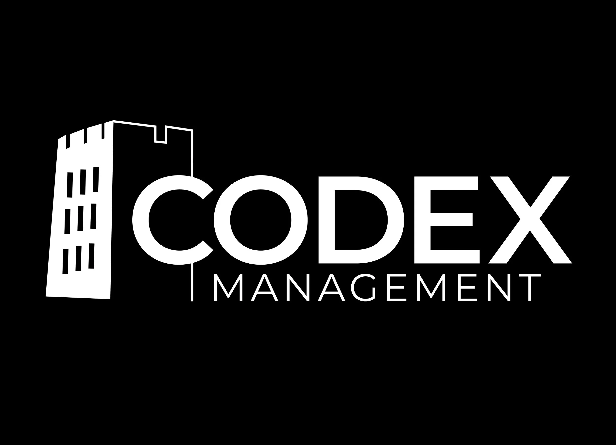
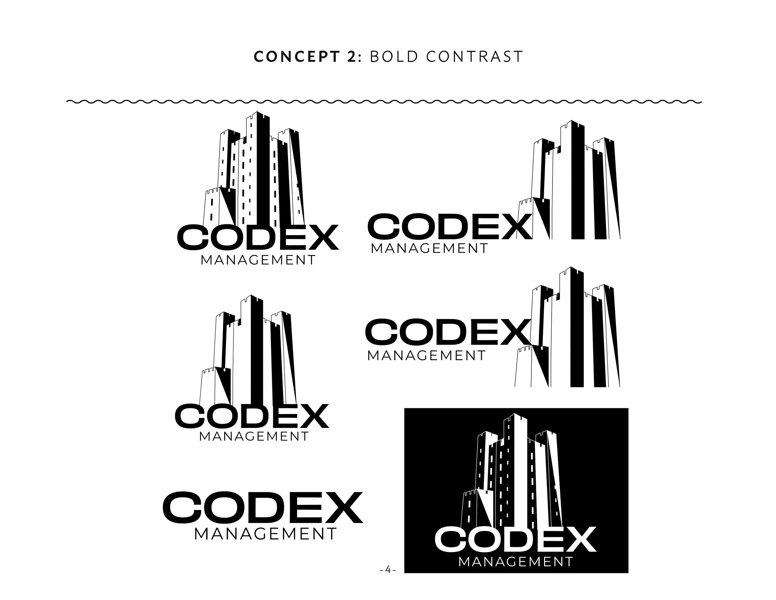
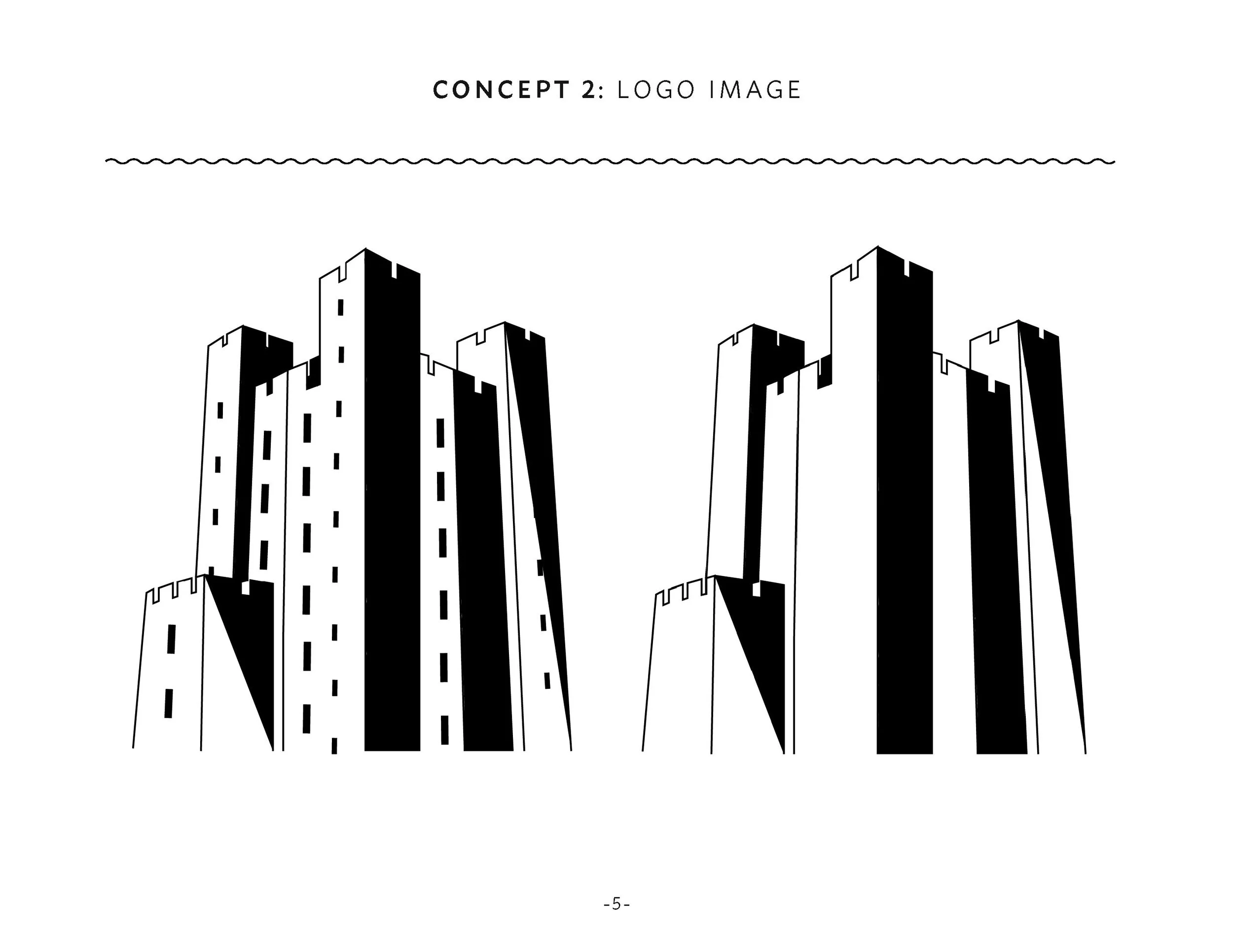
To help clarify the creative design process to my client and further investigate which style they envisioned for their brand, I came up with 4 conceptual key terms to describe each logo iteration. The first is Minimalist Outline, a simple outline illustration of the Keep image, and a font combination that feels modern and simple. The second is Bold Contrast, that features a wide-set typeface and blocked out areas of the main image. The third is a Drafted Sketch option, giving the brand a more architectural presence and suggesting the value of the initial concept stages of a project. The final option was a take on the first two concepts, creating Single Tower Variations as I had enjoyed the idea of the C in Codex integrated with the main image.


Production
The production process took about 4-6 hours, playing around with different logo possibilities, word-mark variations and building off of each logo until I was satisfied with the range of variations offered.
Review
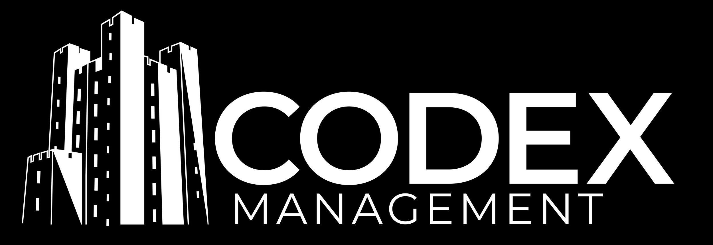
As we completed the project fully remotely, we discussed feedback and alterations via phone call and referred to the packaged pdf I had supplied my client. In the end, they were happy with all 4 concepts, and appreciated the variety of visual concepts so they could compare what they liked most. It came down to the Minimalist Outline, Bold Contrast and Single-Tower variations as they felt the Drafted Sketch option didn’t align with the brand’s ethos. As they intend on printing and implementing the logo at a larger scale, I suggested the Bold/Contrast version would be the wisest choice as it would stand out the most visually.

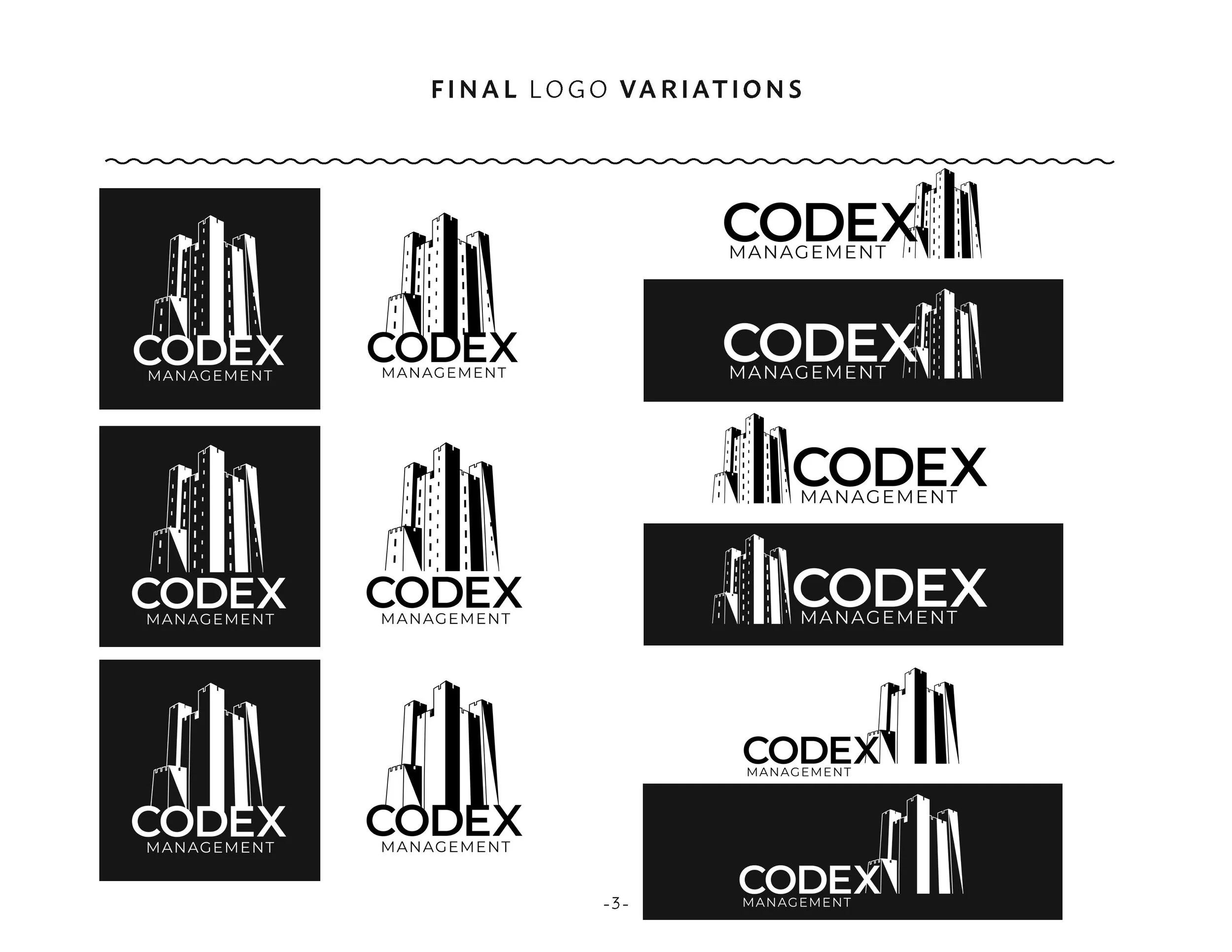

Final Variations
In the end, we changed the original wide-set display typeface for the more rounded features in Montserrat to make the Bolded Contrast design more friendly and universal. I provided the final deliverables in the form of .jpg and .png files, with the addition of the single-tower design and inverted versions to have multiple logo choices and make the design fit best for it’s intended use.