
ARTEMIS BUILDERS
Logo and Wordmark Design

As an additional side project to CODEX Management, Artemis Builders
is a future Home Building Company that is in the initial stages of concept-ualization and planning. My client requested a logo design to help visualize the company’s brand, and represent what Artemis will
bring to others.
The name of the company refers to Artemis: the Greek goddess of hunt and beauty, and one of the seven sisters of Atlas. The company’s slogan From The Ground Up follows the ethos of creating, building and delivering beautiful homes that are fundamentally built to last.
Below is the process for the entire project.
Precedents

The beginning stages for this logo design began with sketching, and putting together what the client already had in mind: an encircled logo with a bow and arrow incorporated with the company name/slogan.
Initial Concepts

To help identify what my client envisioned, I played around with different styles for how the bow + arrow crossed in the enclosed loop, some variations without the enclosed design, and focused on the letter A for Artemis as a main concept as well.
After investigating these different ideas, they were most intrigued with the design on the far left, where the company name cascaded vertically through the arrow.
As this was the same client I had consulted with for Codex Management, I already had a good idea of what they liked in terms of composition and typefaces. Since the company is still a project in the making, I kept the font choices fairly simple—using Montserrat for the main type, and the upper-case A being Big Caslon.
Review

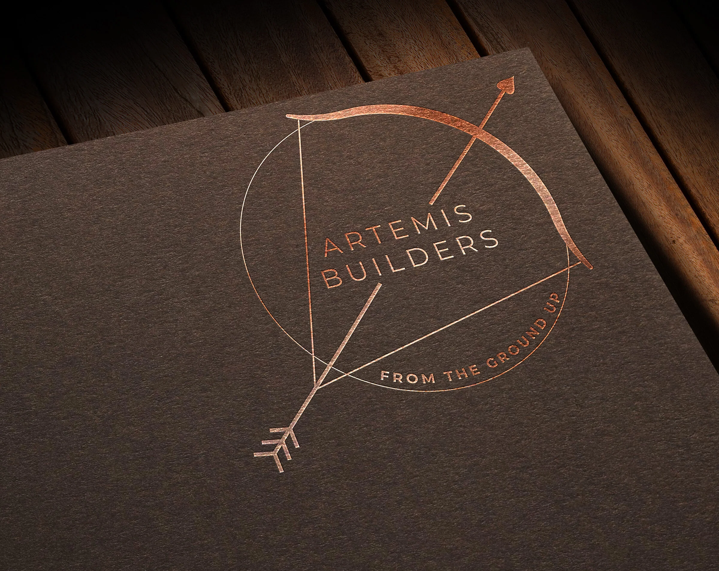
After reviewing the initial concepts and choosing the design on the far left, changes my client requested were to make the company name read as normal and not vertically, make the arrow go through the name, add the slogan From The Ground Up to the bottom of the logo, and to change the regular arrow point into a “spade” shape.
I struggled a little bit with how the bow and arrow visually fit with the text, but in the end incorporated the two elements as seamlessly as possible
I sent over a few different versions to choose from, as we talked over one final review.
Final Logo

In the end, we went with the slanted version of the arrow crossing the bow, and the slogan curved along the bottom edge of the enclosed circle. I look forward to the future launch of Artemis Builders, and to see this final design utilized in various ways!